ENCODE Data
The ENCODE Project generated a wealth of data and publications on DNA and RNA regulatory elements. All this data is freely accesible in their web and most of it also via other sources.
In this example we’ll use ENCODE data downloaded from the UCSC at [http://http://hgdownload.soe.ucsc.edu/goldenPath/hg19/encodeDCC/] to study the chromatin conformation of a small genomic region in the K562 cell line.
We’ll plot the TP53 region and our plot will contain: the genes in the region, the chromatin state as defined by a hidden markov model (HMM) and the peak profiles for a number of histone modifications and a few DNA-binding elements.
Let’s start
We’ll start by defining the region we want to plot and creating a basic karyoplot of that region.
TP53.region <- toGRanges("chr17:7,564,422-7,602,719")

kp <- plotKaryotype(zoom = TP53.region)

And we’ll start by plotting the genes in this region using kpPlotGenes.
We’ll first load the
TxDb.Hsapiens.UCSC.hg19.knownGene, and create a gene.data structure with it
so kpPlotGenes can work.
library(TxDb.Hsapiens.UCSC.hg19.knownGene)

genes.data <- makeGenesDataFromTxDb(TxDb.Hsapiens.UCSC.hg19.knownGene,
                                    karyoplot=kp,
                                    plot.transcripts = TRUE,
                                    plot.transcripts.structure = TRUE)

kp <- plotKaryotype(zoom = TP53.region)
kpPlotGenes(kp, data=genes.data)
We can see all different transcripts for the genes in this region and a number
istead of a gene symbol. We’ll use mergeTranscripts to merge all trascripts
of each gene into one and addGeneNames to transform the identifiers into
standard gene symbols using the data in org.Hs.eg.db. Since we have created the
genes.data automatically, addGeneNames will recognize and load the required
orgDB object automatically. We’ll also use cex to increase the size of the
chromosome name.
genes.data <- addGeneNames(genes.data)
genes.data <- mergeTranscripts(genes.data)

kp <- plotKaryotype(zoom = TP53.region, cex=2)
kpPlotGenes(kp, data=genes.data)
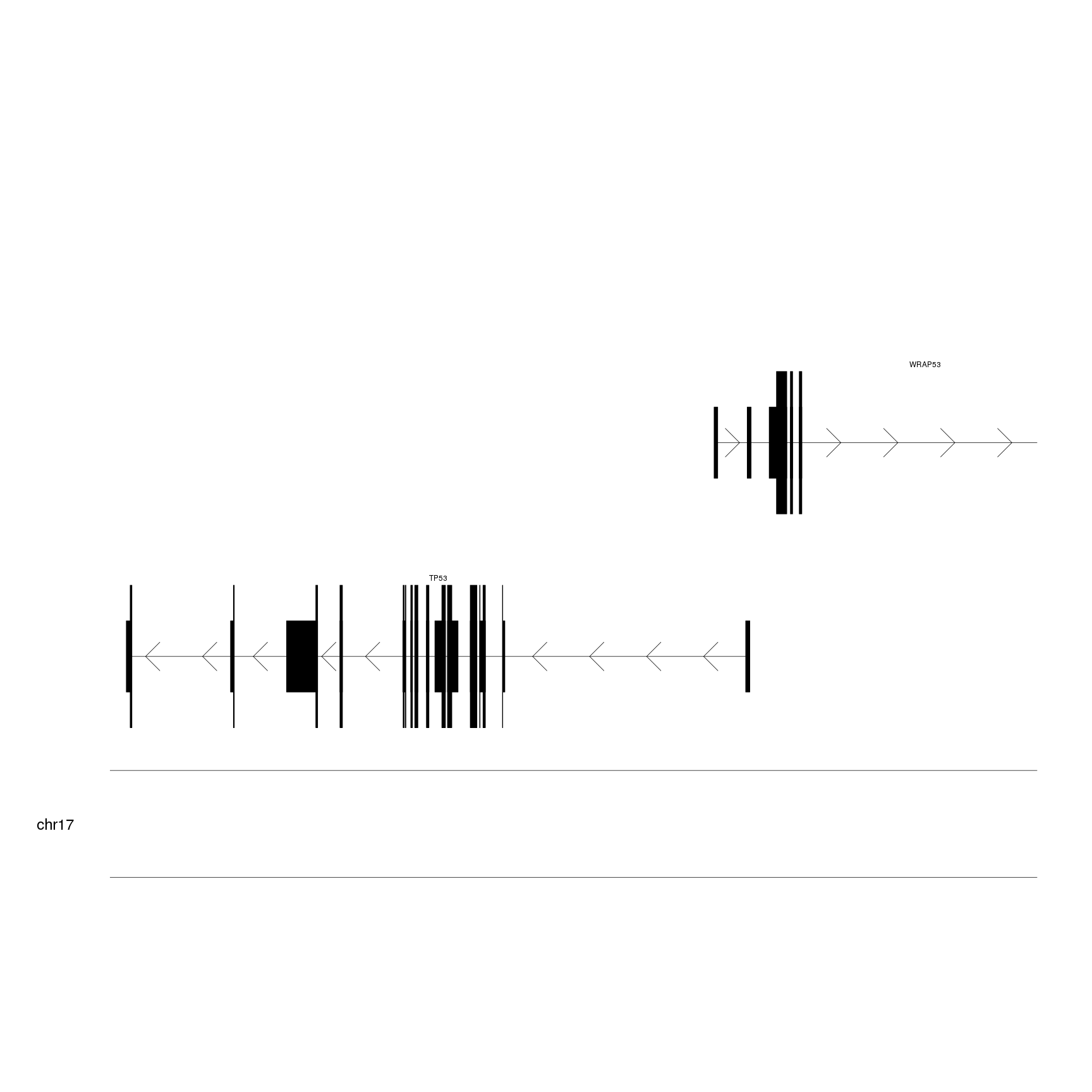
This is a more suitable representation of the genes for our purpose.
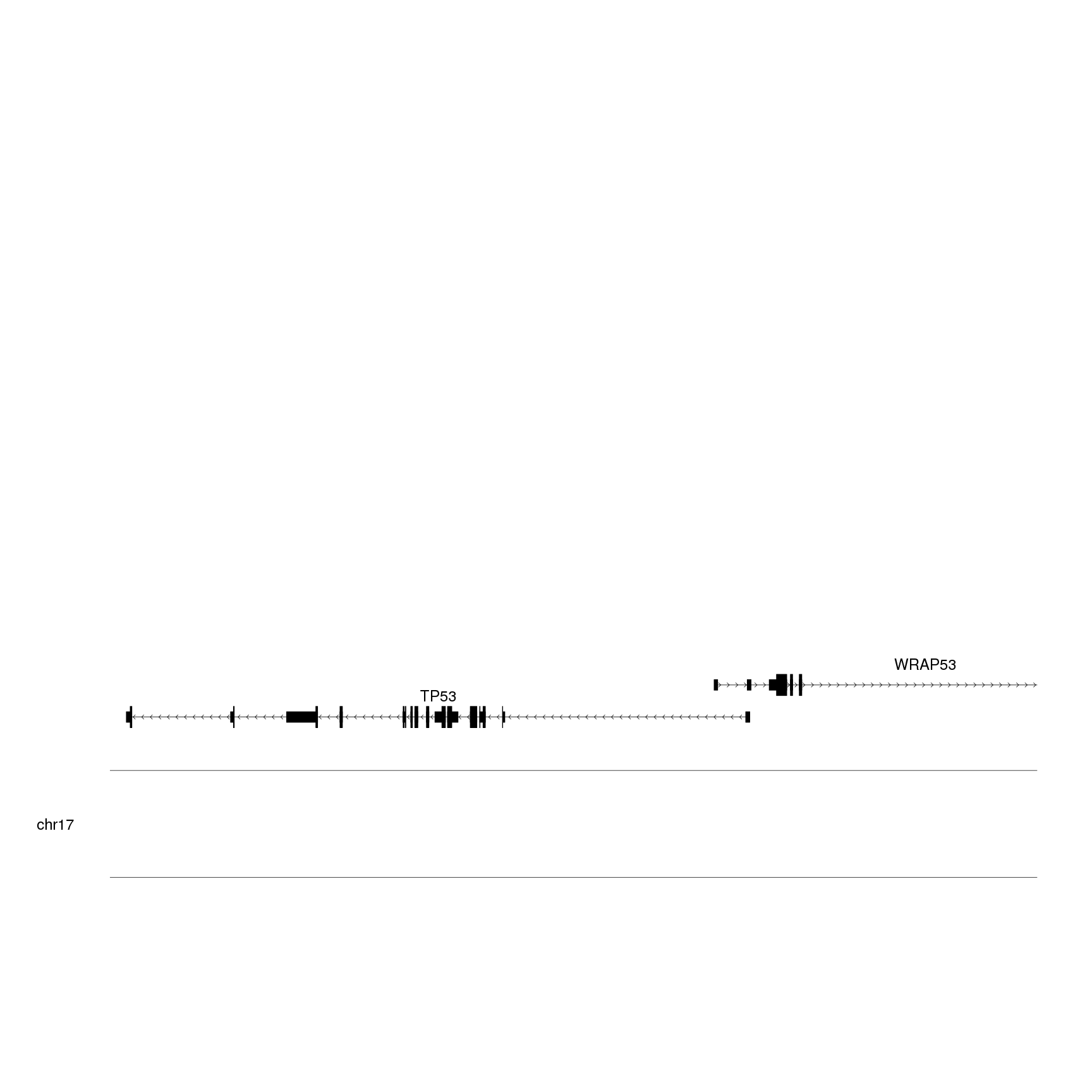
The next step will be using
r0 and r1
to plot the genes at the bottom of the plotting area to leave space for the
other data elements. We’ll also increase the font text size using
gene.name.cex.
kp <- plotKaryotype(zoom = TP53.region, cex=2)
kpPlotGenes(kp, data=genes.data, r0=0, r1=0.15, gene.name.cex = 2)
In our next step, we’ll load the genome state HMM results. We will first use BiocFileCache to download the data file and make it persistent between sessions. This means that we’ll download the file once to our disk and it will be there for us next time.
To load the data into R we’ll use toGRanges from package
regioneR.
library(BiocFileCache)
bfc <- BiocFileCache(ask=FALSE)
K562.hmm.file <- bfcrpath(bfc, "http://hgdownload.soe.ucsc.edu/goldenPath/hg19/encodeDCC/wgEncodeBroadHmm/wgEncodeBroadHmmK562HMM.bed.gz")
K562.hmm <- toGRanges(K562.hmm.file)
K562.hmm
## GRanges object with 622257 ranges and 4 metadata columns:
##            seqnames              ranges strand |              name
##               <Rle>           <IRanges>  <Rle> |       <character>
##        [1]     chr1         10001-10600      * | 15_Repetitive/CNV
##        [2]     chr1         10601-10937      * | 13_Heterochrom/lo
##        [3]     chr1         10938-11937      * |       8_Insulator
##        [4]     chr1         11938-12337      * | 5_Strong_Enhancer
##        [5]     chr1         12338-13137      * |   7_Weak_Enhancer
##        ...      ...                 ...    ... .               ...
##   [622253]     chrX 155256807-155257806      * |       11_Weak_Txn
##   [622254]     chrX 155257807-155259206      * |       8_Insulator
##   [622255]     chrX 155259207-155259406      * |   6_Weak_Enhancer
##   [622256]     chrX 155259407-155259606      * |   7_Weak_Enhancer
##   [622257]     chrX 155259607-155260406      * | 15_Repetitive/CNV
##                score     itemRgb               thick
##            <numeric> <character>           <IRanges>
##        [1]         0     #F5F5F5         10001-10600
##        [2]         0     #F5F5F5         10601-10937
##        [3]         0     #0ABEFE         10938-11937
##        [4]         0     #FACA00         11938-12337
##        [5]         0     #FFFC04         12338-13137
##        ...       ...         ...                 ...
##   [622253]         0     #99FF66 155256807-155257806
##   [622254]         0     #0ABEFE 155257807-155259206
##   [622255]         0     #FFFC04 155259207-155259406
##   [622256]         0     #FFFC04 155259407-155259606
##   [622257]         0     #F5F5F5 155259607-155260406
##   -------
##   seqinfo: 23 sequences from an unspecified genome; no seqlengths
We can see that for each region we have a name and a color. We’ll use the
color column to set the colors of the regions when calling
kpPlotRegions.
kp <- plotKaryotype(zoom = TP53.region, cex=2)
kpPlotGenes(kp, data=genes.data, r0=0, r1=0.15, gene.name.cex = 2)
kpPlotRegions(kp, K562.hmm, col=K562.hmm$itemRgb, r0=0.22, r1=0.3)
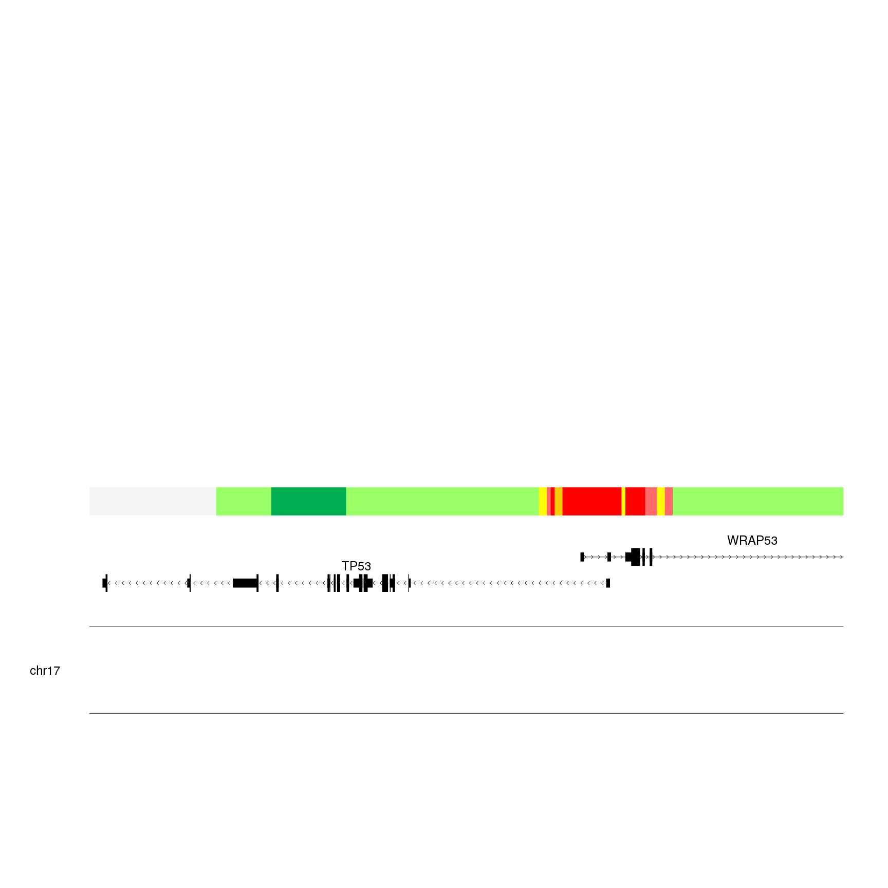 We can see that we have the most interesting part in the region where
the two genes overlap. To start identifying the elements in the plot we’ll use
We can see that we have the most interesting part in the region where
the two genes overlap. To start identifying the elements in the plot we’ll use
kpAddLabels.
kp <- plotKaryotype(zoom = TP53.region, cex=2)
kpPlotGenes(kp, data=genes.data, r0=0, r1=0.15, gene.name.cex = 2)
kpPlotRegions(kp, K562.hmm, col=K562.hmm$itemRgb, r0=0.22, r1=0.3)
kpAddLabels(kp, labels = "Chromatin\nState (HMM)", r0=0.22, r1=0.3, cex=2)
Now that we have the context, we can start adding the epigenetic data. In
this case we’ll plot data contained in
BigWig files using
kpPlotBigWig. Internally, kpPlotBigWig uses
rtracklayer’s
BigWigFile to import
BigWig data. This allows it to take advantage of the BigWig index and remote
loading: we can plot bigwig files either in our own computer or in external
servers (as we will see now) and in any case, only the data required to
our plot will be loaded. In this example we’ll use the ENCODE data passing
the remote file URL to kpPlotBigWig and the function will only download
the data overlapping the visible part of the genome.
IMPORTANT! Due to restrictions in rtracklayer bigwig management,
kpPlotBigWig does not work on Windows. It only works on Linux and Mac
computers.
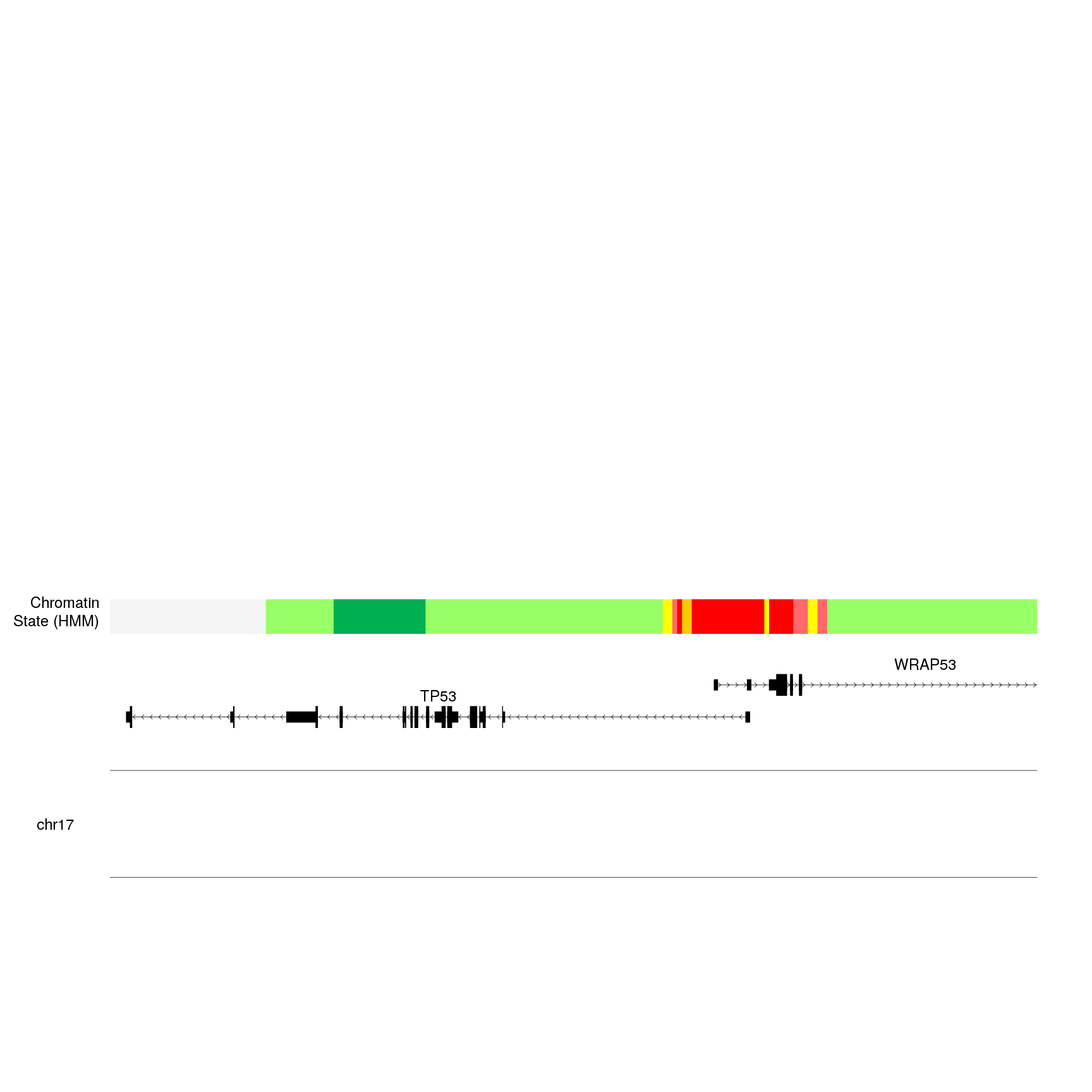
As a first example, we’ll plot the trimethylation levels of the lysine 4 of the histone 3 (H3K4me3). And we will plot it bewteen 0.35 and 1.
kp <- plotKaryotype(zoom = TP53.region, cex=2)
kpPlotGenes(kp, data=genes.data, r0=0, r1=0.15, gene.name.cex = 2)
kpPlotRegions(kp, K562.hmm, col=K562.hmm$itemRgb, r0=0.22, r1=0.3)
kpAddLabels(kp, labels = "Chromatin\nState (HMM)", r0=0.22, r1=0.3, cex=2)

bigwig.file <- "http://hgdownload.soe.ucsc.edu/goldenPath/hg19/encodeDCC/wgEncodeBroadHistone/wgEncodeBroadHistoneK562H3k4me3StdSig.bigWig"

kpPlotBigWig(kp, data=bigwig.file, r0=0.35, r1=1)

We can see a new gray line with a tiny wiggle in the red region. This is not
very informative. The problem we are seeing is that the default ymax value
is set to “global”, that is, ymax will be automatically set to the height of the
tallest peak in the genome, which is much higher than the signal we see in our
region. If we set ymax="visible.region", ymax will be adjusted to the height
of the peaks in the visible region, producing a much nicer plot (and usually
more informative).
kp <- plotKaryotype(zoom = TP53.region, cex=2)
kpPlotGenes(kp, data=genes.data, r0=0, r1=0.15, gene.name.cex = 2)
kpPlotRegions(kp, K562.hmm, col=K562.hmm$itemRgb, r0=0.22, r1=0.3)
kpAddLabels(kp, labels = "Chromatin\nState (HMM)", r0=0.22, r1=0.3, cex=2)

bigwig.file <- "http://hgdownload.soe.ucsc.edu/goldenPath/hg19/encodeDCC/wgEncodeBroadHistone/wgEncodeBroadHistoneK562H3k4me3StdSig.bigWig"

kpPlotBigWig(kp, data=bigwig.file, ymax="visible.region", r0=0.35, r1=1)
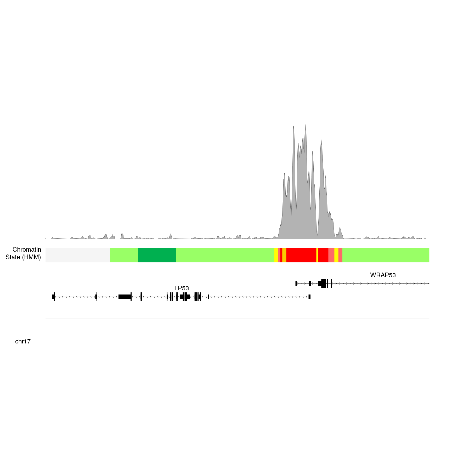
To produce this plot, kpPlotBigWig connected to the UCSC servers, extracted
the data in the bigwig file overlapping the visible region, computed the maximum
value to set ymax and plotted the data.
We can now add other histone modifications to the plot, for example, histone 3 lysine 36 trimethylation (H3K36me3). For that well have to adjust the r0 and r1 specifications.
kp <- plotKaryotype(zoom = TP53.region, cex=2)
kpPlotGenes(kp, data=genes.data, r0=0, r1=0.15, gene.name.cex = 2)
kpPlotRegions(kp, K562.hmm, col=K562.hmm$itemRgb, r0=0.22, r1=0.3)
kpAddLabels(kp, labels = "Chromatin\nState (HMM)", r0=0.22, r1=0.3, cex=2)

H3K4me3.bw <- "http://hgdownload.soe.ucsc.edu/goldenPath/hg19/encodeDCC/wgEncodeBroadHistone/wgEncodeBroadHistoneK562H3k4me3StdSig.bigWig"
kp <- kpPlotBigWig(kp, data=H3K4me3.bw, ymax="visible.region", r0=0.35, r1=0.65)

H3K36me3.bw <- "http://hgdownload.soe.ucsc.edu/goldenPath/hg19/encodeDCC/wgEncodeBroadHistone/wgEncodeBroadHistoneK562H3k36me3StdSig.bigWig"
kpPlotBigWig(kp, data=H3K36me3.bw, ymax="visible.region", r0=0.7, r1=1)
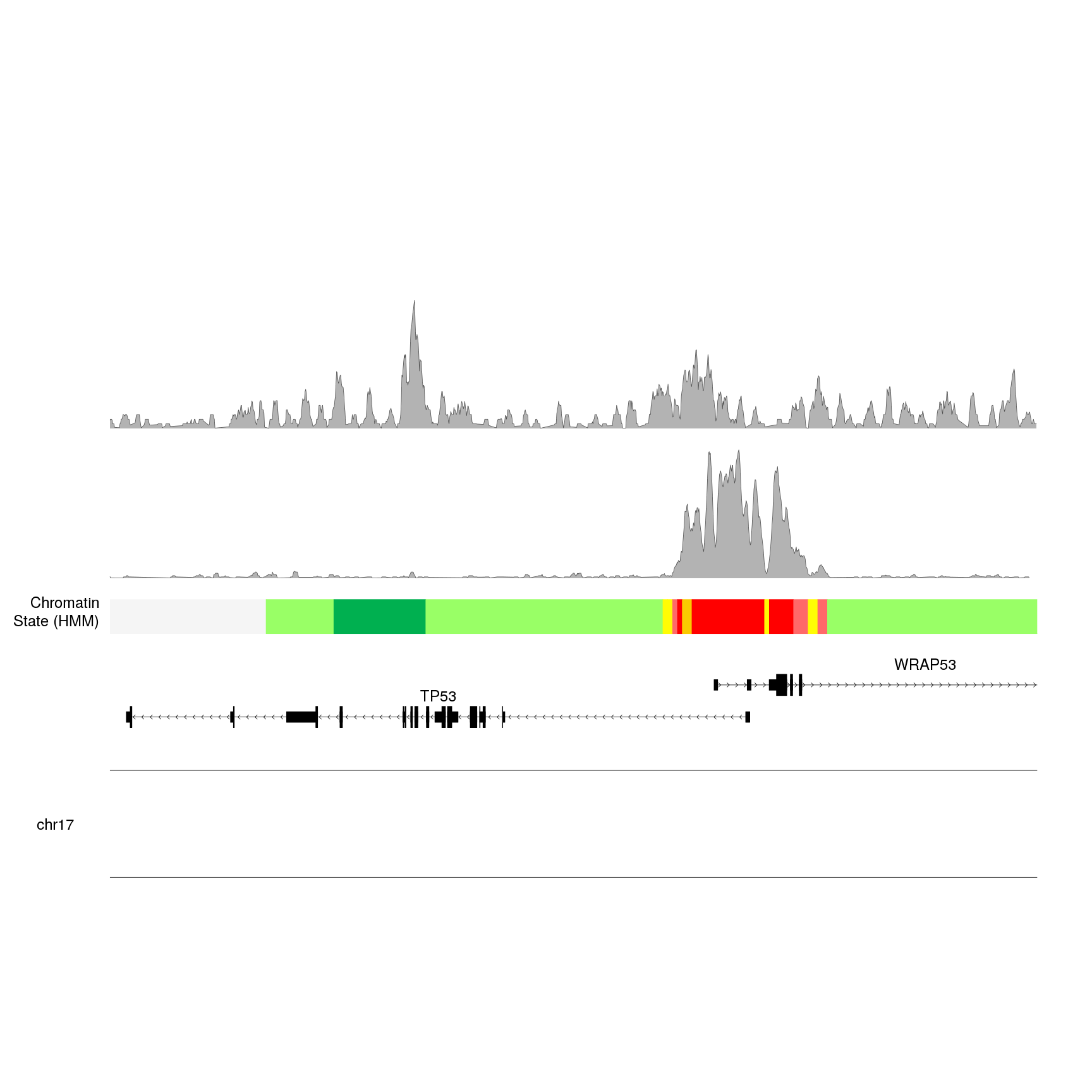
And we can see a pretty different peak profile. However, we are missing some information here: are these peaks comparable? What is the relative height of each one? To help us interpret what we see we can add y axis.
To automatically adjust the axis we will take advantage of the fact that
kpPlotBigWig returns the original karyoplot object with the computed value
for ymax attached. We have to assign the result of kpPlotBigWig to kp and
access the values at kp$latest.plot$computed.values.
We wil also add a label to identify each chromatin mark.
kp <- plotKaryotype(zoom = TP53.region, cex=2)
kpPlotGenes(kp, data=genes.data, r0=0, r1=0.15, gene.name.cex = 2)
kpPlotRegions(kp, K562.hmm, col=K562.hmm$itemRgb, r0=0.22, r1=0.3)
kpAddLabels(kp, labels = "Chromatin\nState (HMM)", r0=0.22, r1=0.3, cex=2)

H3K4me3.bw <- "http://hgdownload.soe.ucsc.edu/goldenPath/hg19/encodeDCC/wgEncodeBroadHistone/wgEncodeBroadHistoneK562H3k4me3StdSig.bigWig"
kp <- kpPlotBigWig(kp, data=H3K4me3.bw, ymax="visible.region", r0=0.35, r1=0.65)
computed.ymax <- kp$latest.plot$computed.values$ymax
kpAxis(kp, ymin=0, ymax=computed.ymax, r0=0.35, r1=0.65)
kpAddLabels(kp, labels = "H3K4me3", r0=0.35, r1=0.65, cex=1.6, label.margin = 0.035)

H3K36me3.bw <- "http://hgdownload.soe.ucsc.edu/goldenPath/hg19/encodeDCC/wgEncodeBroadHistone/wgEncodeBroadHistoneK562H3k36me3StdSig.bigWig"
kp <- kpPlotBigWig(kp, data=H3k36me3.bw, ymax="visible.region", r0=0.7, r1=1)
computed.ymax <- kp$latest.plot$computed.values$ymax
kpAxis(kp, ymin=0, ymax=computed.ymax, r0=0.7, r1=1)
kpAddLabels(kp, labels = "H3K36me3", r0=0.7, r1=1, cex=1.6, label.margin = 0.035)
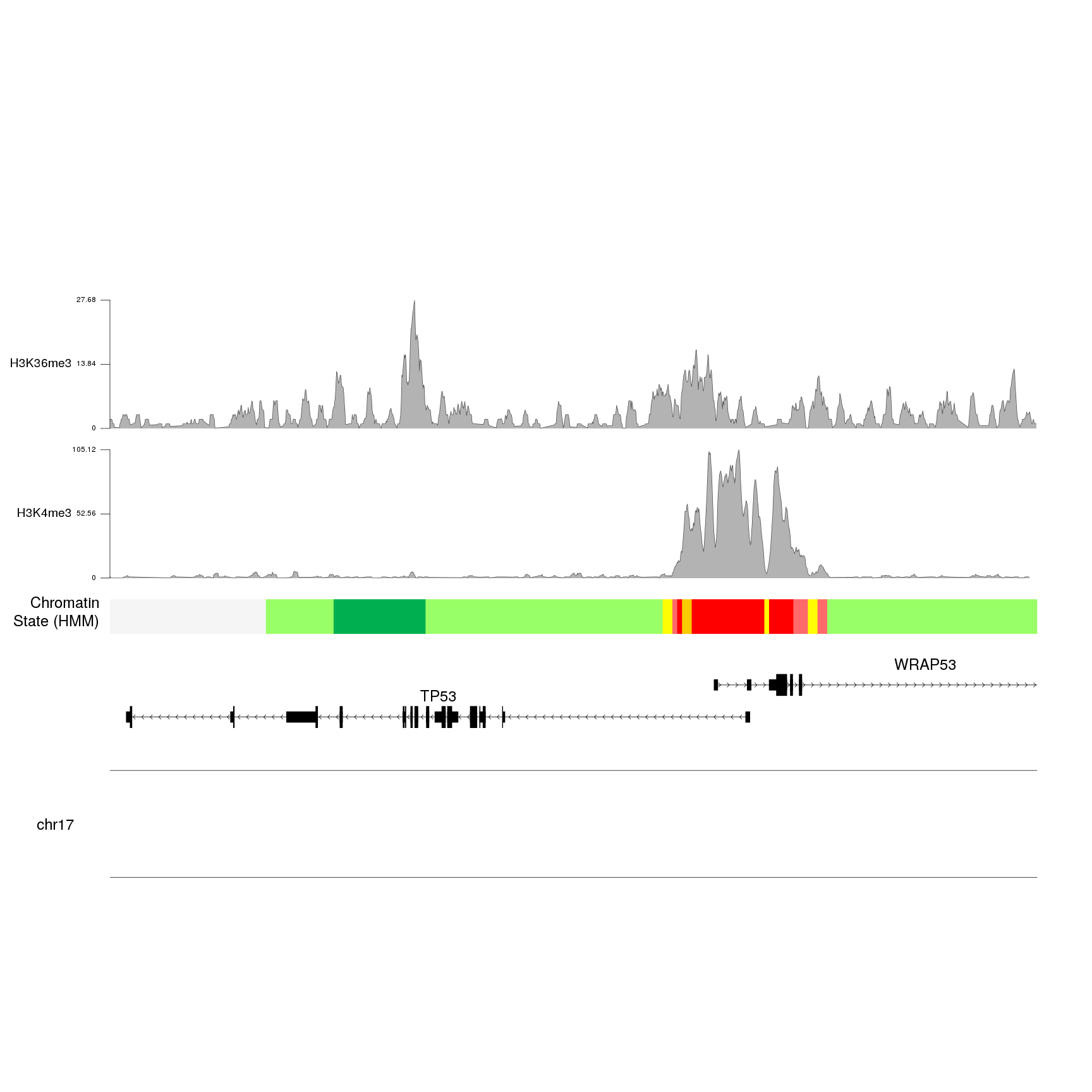
And we can see that the values for H3K4me3 are about four times higher than the ones for H3K36me3.
What we can also see is that we have started repeating code and that it
would be better to use a loop for that. We will use the
autotrack function to automatically get the r0 and r1 values.
In addition, we will improve the axis definition with a ceiling call.
histone.marks <- c(H3K4me3="wgEncodeBroadHistoneK562H3k4me3StdSig.bigWig",
                   H3K36me3="wgEncodeBroadHistoneK562H3k36me3StdSig.bigWig")

base.url <- "http://hgdownload.soe.ucsc.edu/goldenPath/hg19/encodeDCC/wgEncodeBroadHistone/"

kp <- plotKaryotype(zoom = TP53.region, cex=2)
kpPlotGenes(kp, data=genes.data, r0=0, r1=0.15, gene.name.cex = 2)
kpPlotRegions(kp, K562.hmm, col=K562.hmm$itemRgb, r0=0.22, r1=0.3)
kpAddLabels(kp, labels = "Chromatin\nState (HMM)", r0=0.22, r1=0.3, cex=2)

for(i in seq_len(length(histone.marks))) {
  bigwig.file <- paste0(base.url, histone.marks[i])
  at <- autotrack(i, length(histone.marks), r0=0.35, r1=1)
  kp <- kpPlotBigWig(kp, data=bigwig.file, ymax="visible.region",
                     r0=at$r0, r1=at$r1)
  computed.ymax <- ceiling(kp$latest.plot$computed.values$ymax)
  kpAxis(kp, ymin=0, ymax=computed.ymax, numticks = 2, r0=at$r0, r1=at$r1)
  kpAddLabels(kp, labels = names(histone.marks)[i], r0=at$r0, r1=at$r1,
              cex=1.6, label.margin = 0.035)
}

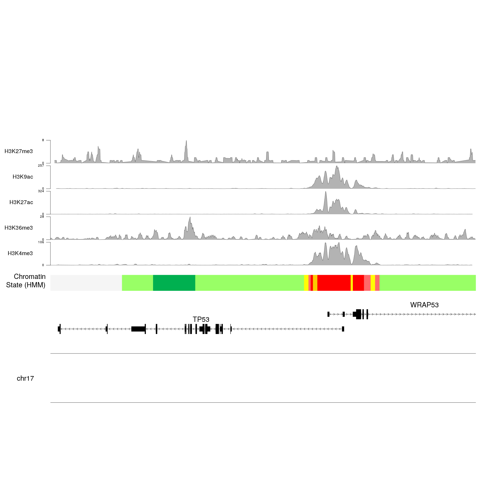
Once we have the for loop and the autotrack in place, we can increase the
number of histone marks and everything will autoadjust.
histone.marks <- c(H3K4me3="wgEncodeBroadHistoneK562H3k4me3StdSig.bigWig",
                   H3K36me3="wgEncodeBroadHistoneK562H3k36me3StdSig.bigWig",
                   H3K27ac="wgEncodeBroadHistoneK562H3k27acStdSig.bigWig",
                   H3K9ac="wgEncodeBroadHistoneK562H3k9acStdSig.bigWig",
                   H3K27me3="wgEncodeBroadHistoneK562H3k27me3StdSig.bigWig")

base.url <- "http://hgdownload.soe.ucsc.edu/goldenPath/hg19/encodeDCC/wgEncodeBroadHistone/"

kp <- plotKaryotype(zoom = TP53.region, cex=2)
kpPlotGenes(kp, data=genes.data, r0=0, r1=0.15, gene.name.cex = 2)
kpPlotRegions(kp, K562.hmm, col=K562.hmm$itemRgb, r0=0.22, r1=0.3)
kpAddLabels(kp, labels = "Chromatin\nState (HMM)", r0=0.22, r1=0.3, cex=2)

for(i in seq_len(length(histone.marks))) {
  bigwig.file <- paste0(base.url, histone.marks[i])
  at <- autotrack(i, length(histone.marks), r0=0.35, r1=1, margin = 0.1)
  kp <- kpPlotBigWig(kp, data=bigwig.file, ymax="visible.region",
                     r0=at$r0, r1=at$r1)
  computed.ymax <- ceiling(kp$latest.plot$computed.values$ymax)
  kpAxis(kp, ymin=0, ymax=computed.ymax, numticks = 2, r0=at$r0, r1=at$r1)
  kpAddLabels(kp, labels = names(histone.marks)[i], r0=at$r0, r1=at$r1,
              cex=1.6, label.margin = 0.035)
}
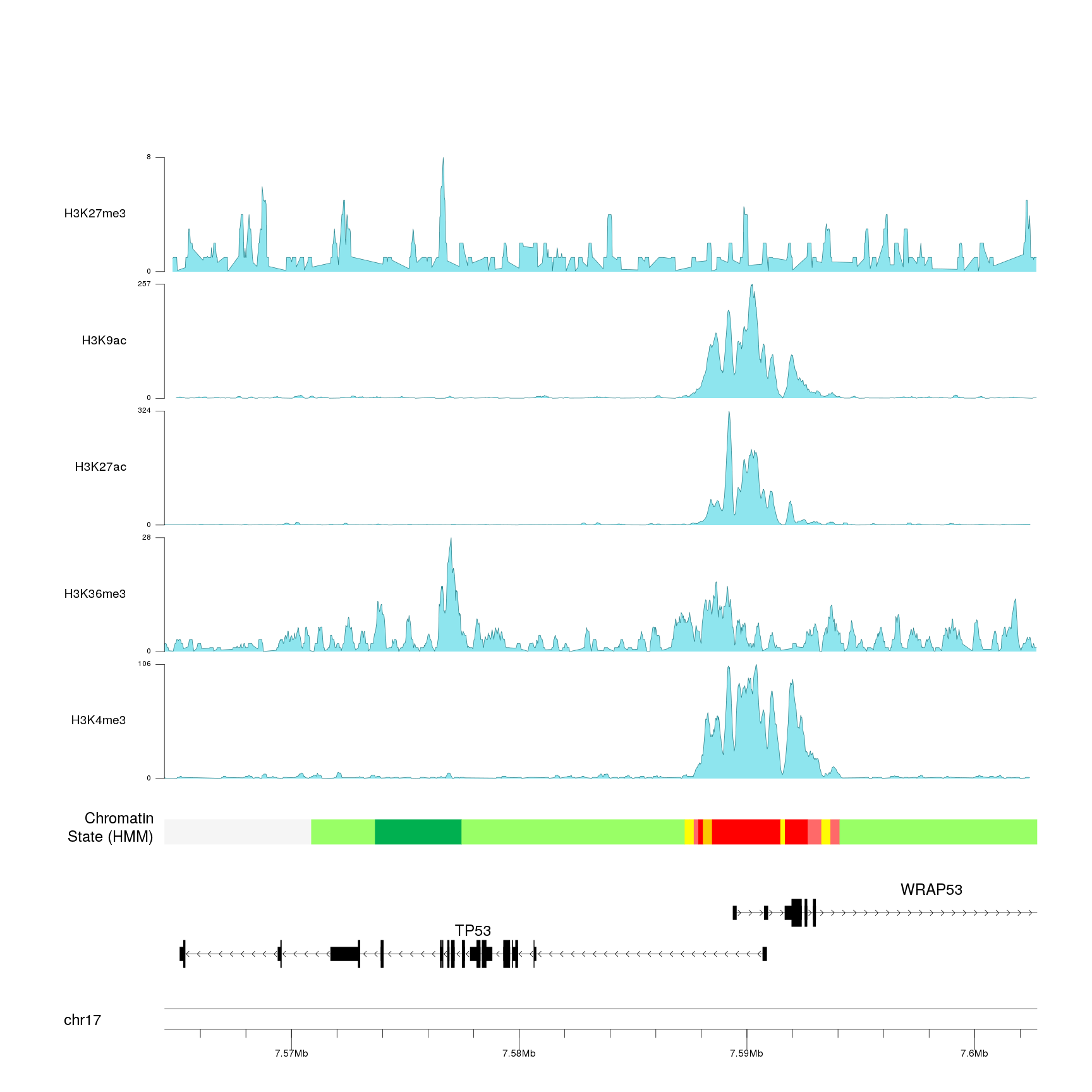
We can now adjust the plotting parameters to reduce the margins and the ideogram height and change the colors to improve the general appearance of the plot.
pp <- getDefaultPlotParams(plot.type=1)
pp$leftmargin <- 0.15
pp$topmargin <- 15
pp$bottommargin <- 15
pp$ideogramheight <- 5
pp$data1inmargin <- 10

kp <- plotKaryotype(zoom = TP53.region, cex=2, plot.params = pp)
kpAddBaseNumbers(kp, tick.dist = 10000, minor.tick.dist = 2000,
                 add.units = TRUE, cex=1.3, digits = 6)
kpPlotGenes(kp, data=genes.data, r0=0, r1=0.1, gene.name.cex = 2)
kpPlotRegions(kp, K562.hmm, col=K562.hmm$itemRgb, r0=0.15, r1=0.18)
kpAddLabels(kp, labels = "Chromatin\nState (HMM)", r0=0.15, r1=0.18, cex=2)

for(i in seq_len(length(histone.marks))) {
  bigwig.file <- paste0(base.url, histone.marks[i])
  at <- autotrack(i, length(histone.marks), r0=0.23, r1=1, margin = 0.1)
  kp <- kpPlotBigWig(kp, data=bigwig.file, ymax="visible.region",
                     r0=at$r0, r1=at$r1, col = "cadetblue2")
  computed.ymax <- ceiling(kp$latest.plot$computed.values$ymax)
  kpAxis(kp, ymin=0, ymax=computed.ymax, numticks = 2, r0=at$r0, r1=at$r1)
  kpAddLabels(kp, labels = names(histone.marks)[i], r0=at$r0, r1=at$r1,
              cex=1.6, label.margin = 0.035)
}
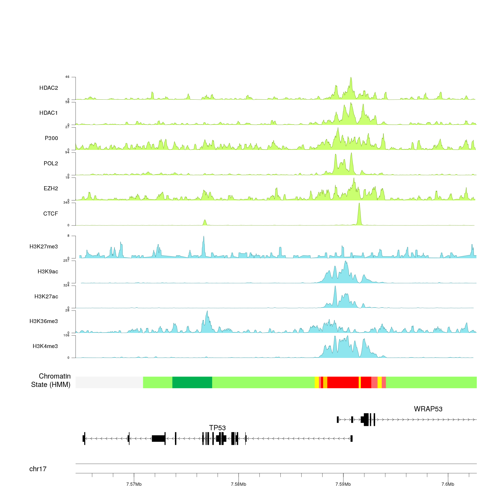
And we can even add other experimental peaks and use nested
autotrack to
position them all.
base.url <- "http://hgdownload.soe.ucsc.edu/goldenPath/hg19/encodeDCC/wgEncodeBroadHistone/"
histone.marks <- c(H3K4me3="wgEncodeBroadHistoneK562H3k4me3StdSig.bigWig",
                   H3K36me3="wgEncodeBroadHistoneK562H3k36me3StdSig.bigWig",
                   H3K27ac="wgEncodeBroadHistoneK562H3k27acStdSig.bigWig",
                   H3K9ac="wgEncodeBroadHistoneK562H3k9acStdSig.bigWig",
                   H3K27me3="wgEncodeBroadHistoneK562H3k27me3StdSig.bigWig")

DNA.binding <- c(CTCF="wgEncodeBroadHistoneK562CtcfStdSig.bigWig",
                 EZH2="wgEncodeBroadHistoneK562Ezh239875StdSig.bigWig",
                 POL2="wgEncodeBroadHistoneK562Pol2bStdSig.bigWig",
                 P300="wgEncodeBroadHistoneK562P300StdSig.bigWig",
                 HDAC1="wgEncodeBroadHistoneK562Hdac1sc6298StdSig.bigWig",
                 HDAC2="wgEncodeBroadHistoneK562Hdac2a300705aStdSig.bigWig")


pp <- getDefaultPlotParams(plot.type=1)
pp$leftmargin <- 0.15
pp$topmargin <- 15
pp$bottommargin <- 15
pp$ideogramheight <- 5
pp$data1inmargin <- 10

kp <- plotKaryotype(zoom = TP53.region, cex=2, plot.params = pp)
kpAddBaseNumbers(kp, tick.dist = 10000, minor.tick.dist = 2000,
                 add.units = TRUE, cex=1.3, digits = 6)
kpPlotGenes(kp, data=genes.data, r0=0, r1=0.1, gene.name.cex = 2)
kpPlotRegions(kp, K562.hmm, col=K562.hmm$itemRgb, r0=0.15, r1=0.18)
kpAddLabels(kp, labels = "Chromatin\nState (HMM)", r0=0.15, r1=0.18, cex=2)

#Histone marks
total.tracks <- length(histone.marks)+length(DNA.binding)
out.at <- autotrack(1:length(histone.marks), total.tracks, margin = 0.3, r0=0.23)

for(i in seq_len(length(histone.marks))) {
  bigwig.file <- paste0(base.url, histone.marks[i])
  at <- autotrack(i, length(histone.marks), r0=out.at$r0, r1=out.at$r1, margin = 0.1)
  kp <- kpPlotBigWig(kp, data=bigwig.file, ymax="visible.region",
                     r0=at$r0, r1=at$r1, col = "cadetblue2")
  computed.ymax <- ceiling(kp$latest.plot$computed.values$ymax)
  kpAxis(kp, ymin=0, ymax=computed.ymax, numticks = 2, r0=at$r0, r1=at$r1)
  kpAddLabels(kp, labels = names(histone.marks)[i], r0=at$r0, r1=at$r1,
              cex=1.6, label.margin = 0.035)
}

#DNA binding proteins
out.at <- autotrack((length(histone.marks)+1):total.tracks, total.tracks, margin = 0.3, r0=0.23)

for(i in seq_len(length(DNA.binding))) {
  bigwig.file <- paste0(base.url, DNA.binding[i])
  at <- autotrack(i, length(DNA.binding), r0=out.at$r0, r1=out.at$r1, margin = 0.1)
  kp <- kpPlotBigWig(kp, data=bigwig.file, ymax="visible.region",
                     r0=at$r0, r1=at$r1, col = "darkolivegreen1")
  computed.ymax <- ceiling(kp$latest.plot$computed.values$ymax)
  kpAxis(kp, ymin=0, ymax=computed.ymax, numticks = 2, r0=at$r0, r1=at$r1)
  kpAddLabels(kp, labels = names(DNA.binding)[i], r0=at$r0, r1=at$r1,
              cex=1.6, label.margin = 0.035)
}
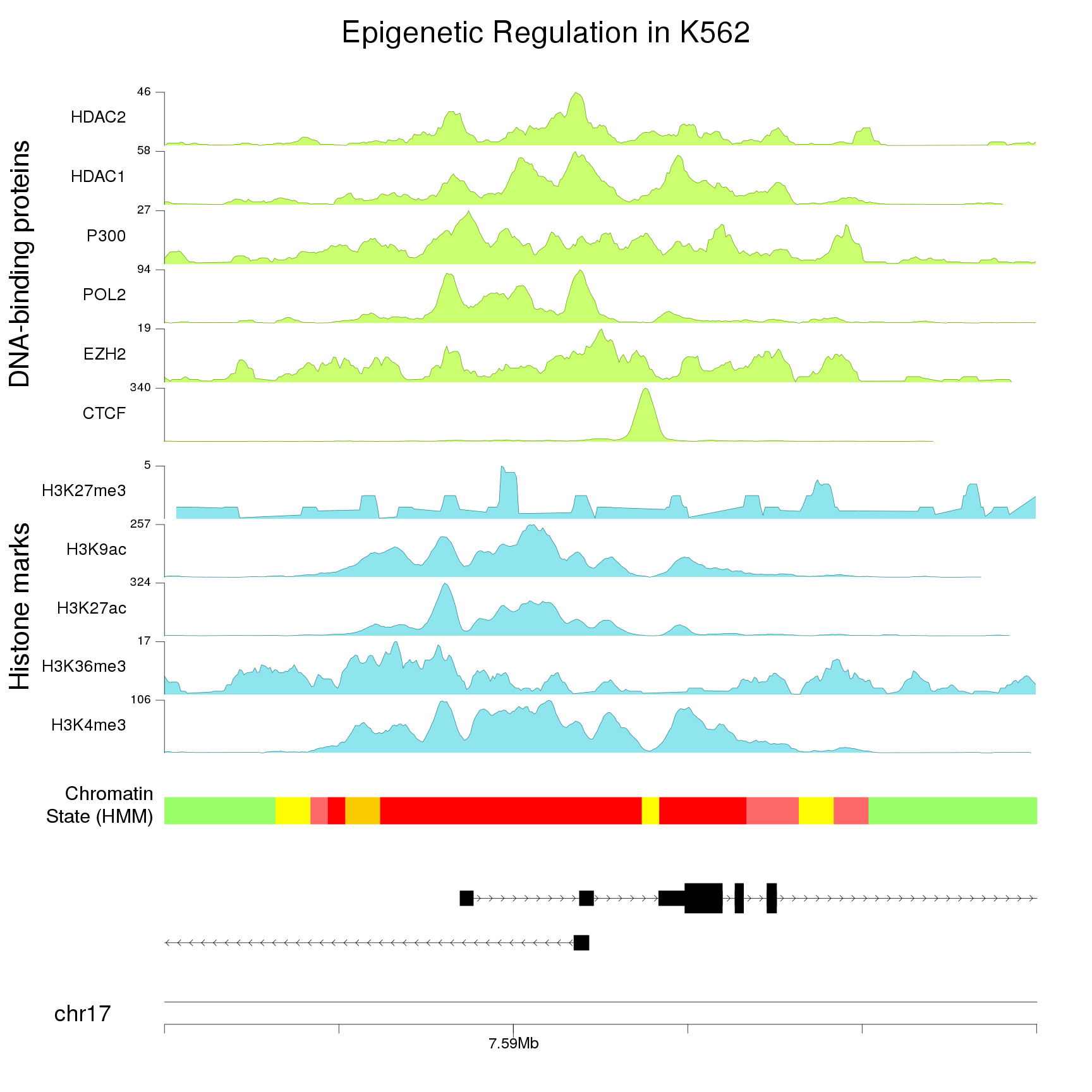
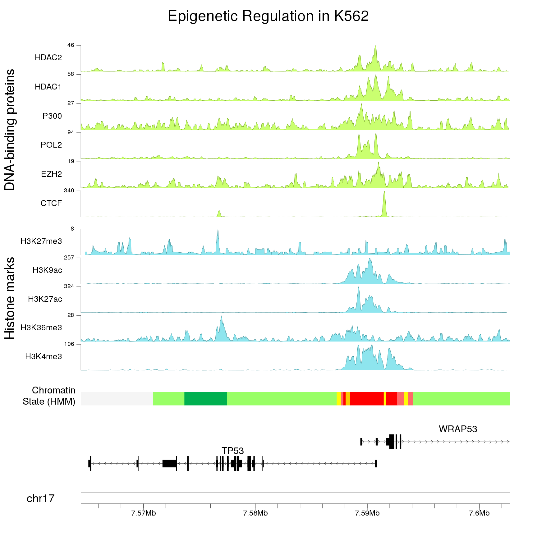
And add a main title, a couple of additional labels and adjust a few parameters (text sizes, etc…) to get a better final image.
base.url <- "http://hgdownload.soe.ucsc.edu/goldenPath/hg19/encodeDCC/wgEncodeBroadHistone/"
histone.marks <- c(H3K4me3="wgEncodeBroadHistoneK562H3k4me3StdSig.bigWig",
                   H3K36me3="wgEncodeBroadHistoneK562H3k36me3StdSig.bigWig",
                   H3K27ac="wgEncodeBroadHistoneK562H3k27acStdSig.bigWig",
                   H3K9ac="wgEncodeBroadHistoneK562H3k9acStdSig.bigWig",
                   H3K27me3="wgEncodeBroadHistoneK562H3k27me3StdSig.bigWig")

DNA.binding <- c(CTCF="wgEncodeBroadHistoneK562CtcfStdSig.bigWig",
                 EZH2="wgEncodeBroadHistoneK562Ezh239875StdSig.bigWig",
                 POL2="wgEncodeBroadHistoneK562Pol2bStdSig.bigWig",
                 P300="wgEncodeBroadHistoneK562P300StdSig.bigWig",
                 HDAC1="wgEncodeBroadHistoneK562Hdac1sc6298StdSig.bigWig",
                 HDAC2="wgEncodeBroadHistoneK562Hdac2a300705aStdSig.bigWig")


pp <- getDefaultPlotParams(plot.type=1)
pp$leftmargin <- 0.15
pp$topmargin <- 15
pp$bottommargin <- 15
pp$ideogramheight <- 5
pp$data1inmargin <- 10
pp$data1outmargin <- 0

kp <- plotKaryotype(zoom = TP53.region, cex=3, plot.params = pp)
kpAddBaseNumbers(kp, tick.dist = 10000, minor.tick.dist = 2000,
                 add.units = TRUE, cex=2, tick.len = 3)
kpAddMainTitle(kp, "Epigenetic Regulation in K562", cex=4)
kpPlotGenes(kp, data=genes.data, r0=0, r1=0.1, gene.name.cex = 2.5)
kpPlotRegions(kp, K562.hmm, col=K562.hmm$itemRgb, r0=0.15, r1=0.18)
kpAddLabels(kp, labels = "Chromatin\nState (HMM)", r0=0.15, r1=0.18, cex=2.5)

#Histone marks
total.tracks <- length(histone.marks)+length(DNA.binding)
out.at <- autotrack(1:length(histone.marks), total.tracks, margin = 0.3, r0=0.23)
kpAddLabels(kp, labels = "Histone marks", r0 = out.at$r0, r1=out.at$r1, cex=3.5,
            srt=90, pos=1, label.margin = 0.14)

for(i in seq_len(length(histone.marks))) {
  bigwig.file <- paste0(base.url, histone.marks[i])
  at <- autotrack(i, length(histone.marks), r0=out.at$r0, r1=out.at$r1, margin = 0.1)
  kp <- kpPlotBigWig(kp, data=bigwig.file, ymax="visible.region",
                     r0=at$r0, r1=at$r1, col = "cadetblue2")
  computed.ymax <- ceiling(kp$latest.plot$computed.values$ymax)
  kpAxis(kp, ymin=0, ymax=computed.ymax, tick.pos = computed.ymax,
         r0=at$r0, r1=at$r1, cex=1.6)
  kpAddLabels(kp, labels = names(histone.marks)[i], r0=at$r0, r1=at$r1,
              cex=2.2, label.margin = 0.035)
}

#DNA binding proteins
out.at <- autotrack((length(histone.marks)+1):total.tracks, total.tracks, margin = 0.3, r0=0.23)

kpAddLabels(kp, labels = "DNA-binding proteins", r0 = out.at$r0, r1=out.at$r1,
             cex=3.5, srt=90, pos=1, label.margin = 0.14)
for(i in seq_len(length(DNA.binding))) {
  bigwig.file <- paste0(base.url, DNA.binding[i])
  at <- autotrack(i, length(DNA.binding), r0=out.at$r0, r1=out.at$r1, margin = 0.1)
  kp <- kpPlotBigWig(kp, data=bigwig.file, ymax="visible.region",
                     r0=at$r0, r1=at$r1, col = "darkolivegreen1")
  computed.ymax <- ceiling(kp$latest.plot$computed.values$ymax)
  kpAxis(kp, ymin=0, ymax=computed.ymax, tick.pos = computed.ymax,
         r0=at$r0, r1=at$r1, cex=1.6)
  kpAddLabels(kp, labels = names(DNA.binding)[i], r0=at$r0, r1=at$r1,
              cex=2.2, label.margin = 0.035)
}
As always with karyoploteR, we can change the plotting region (zoom in this case) to plot any part of the genome, for example, a detailed view of the overlapping zone.
TP53.promoter.region <- toGRanges("chr17:7586000-7596000")
kp <- plotKaryotype(zoom = TP53.promoter.region, cex=3, plot.params = pp)
kpAddBaseNumbers(kp, tick.dist = 10000, minor.tick.dist = 2000,
                 add.units = TRUE, cex=2, tick.len = 3)
kpAddMainTitle(kp, "Epigenetic Regulation in K562", cex=4)
kpPlotGenes(kp, data=genes.data, r0=0, r1=0.1, gene.name.cex = 2.5)
kpPlotRegions(kp, K562.hmm, col=K562.hmm$itemRgb, r0=0.15, r1=0.18)
kpAddLabels(kp, labels = "Chromatin\nState (HMM)", r0=0.15, r1=0.18, cex=2.5)

#Histone marks
total.tracks <- length(histone.marks)+length(DNA.binding)
out.at <- autotrack(1:length(histone.marks), total.tracks, margin = 0.3, r0=0.23)
kpAddLabels(kp, labels = "Histone marks", r0 = out.at$r0, r1=out.at$r1, cex=3.5,
            srt=90, pos=1, label.margin = 0.14)

for(i in seq_len(length(histone.marks))) {
  bigwig.file <- paste0(base.url, histone.marks[i])
  at <- autotrack(i, length(histone.marks), r0=out.at$r0, r1=out.at$r1, margin = 0.1)
  kp <- kpPlotBigWig(kp, data=bigwig.file, ymax="visible.region",
                     r0=at$r0, r1=at$r1, col = "cadetblue2")
  computed.ymax <- ceiling(kp$latest.plot$computed.values$ymax)
  kpAxis(kp, ymin=0, ymax=computed.ymax, tick.pos = computed.ymax,
         r0=at$r0, r1=at$r1, cex=1.6)
  kpAddLabels(kp, labels = names(histone.marks)[i], r0=at$r0, r1=at$r1,
              cex=2.2, label.margin = 0.035)
}

#DNA binding proteins
out.at <- autotrack((length(histone.marks)+1):total.tracks, total.tracks, margin = 0.3, r0=0.23)

kpAddLabels(kp, labels = "DNA-binding proteins", r0 = out.at$r0, r1=out.at$r1,
             cex=3.5, srt=90, pos=1, label.margin = 0.14)
for(i in seq_len(length(DNA.binding))) {
  bigwig.file <- paste0(base.url, DNA.binding[i])
  at <- autotrack(i, length(DNA.binding), r0=out.at$r0, r1=out.at$r1, margin = 0.1)
  kp <- kpPlotBigWig(kp, data=bigwig.file, ymax="visible.region",
                     r0=at$r0, r1=at$r1, col = "darkolivegreen1")
  computed.ymax <- ceiling(kp$latest.plot$computed.values$ymax)
  kpAxis(kp, ymin=0, ymax=computed.ymax, tick.pos = computed.ymax,
         r0=at$r0, r1=at$r1, cex=1.6)
  kpAddLabels(kp, labels = names(DNA.binding)[i], r0=at$r0, r1=at$r1,
              cex=2.2, label.margin = 0.035)
}