Gene expression results from DESeq2
Since karyoploteR knows nothing about the data being plotted, it can be used to plot almost anything on the genome. In this example we’ll see how to plot the differential expression results obtained with DESeq2. We can plot differential expression results in many different ways, but in this case we’ll map the differentially expressed genes onto the genome and plot them with karyoploteR.
As an example, we’ll work with example data available in Bioconductor, but the steps to produce the final plots should be mostly the same with any other dataset.
We’ll perform the differential expression analysis exactly as described in the DESeq2 vignette and we will use the data from the pasilla dataset, which is RNA-seq data from Drosophila and is briefly described in a section of the DESeq2 vignette.
We’ll start with the preparation of the DESeq2 object from the initial gene counts and the annotation data.
#Code extracted from the DESeq2 vignette

library("pasilla")
library("DESeq2")

pasCts <- system.file("extdata", "pasilla_gene_counts.tsv", package="pasilla", mustWork=TRUE)
pasAnno <- system.file("extdata", "pasilla_sample_annotation.csv", package="pasilla", mustWork=TRUE)
cts <- as.matrix(read.csv(pasCts,sep="\t",row.names="gene_id"))
coldata <- read.csv(pasAnno, row.names=1)
coldata <- coldata[,c("condition","type")]

rownames(coldata) <- sub("fb", "", rownames(coldata))
cts <- cts[, rownames(coldata)]

dds <- DESeqDataSetFromMatrix(countData = cts,
                              colData = coldata,
                              design = ~ condition)
dds$condition <- relevel(dds$condition, ref = "untreated")
dds
## class: DESeqDataSet
## dim: 14599 7
## metadata(1): version
## assays(1): counts
## rownames(14599): FBgn0000003 FBgn0000008 ... FBgn0261574
##   FBgn0261575
## rowData names(0):
## colnames(7): treated1 treated2 ... untreated3 untreated4
## colData names(2): condition type
And run DESeq to perfrom the differential analysis
dds <- DESeq(dds)
res <- results(dds)
res <- lfcShrink(dds, coef = 2, res = res)
res
## log2 fold change (MAP): condition treated vs untreated
## Wald test p-value: condition treated vs untreated
## DataFrame with 14599 rows and 6 columns
##                      baseMean      log2FoldChange              lfcSE
##                     <numeric>           <numeric>          <numeric>
## FBgn0000003 0.171568715207063 0.00710726790282617 0.0287634388887901
## FBgn0000008  95.1440789963134 0.00147804699780288  0.154073501423252
## FBgn0000014  1.05657219346166 -0.0119731903236629  0.050434666535828
## FBgn0000015 0.846723274987709 -0.0466564545098943 0.0525930092211504
## FBgn0000017   4352.5928987935   -0.20984748963473  0.110199795853237
## ...                       ...                 ...                ...
## FBgn0261571 0.087343676946538 0.00710726790282618 0.0287634388887901
## FBgn0261572  6.19713652050888   -0.14749378638101  0.122892963206406
## FBgn0261573  2240.98398636611  0.0113157859777773  0.101093649270192
## FBgn0261574  4857.74267170989  0.0114111134835376   0.14443859782049
## FBgn0261575  10.6835537573787  0.0188614981282305  0.104627915610397
##                            stat             pvalue              padj
##                       <numeric>          <numeric>         <numeric>
## FBgn0000003   0.269612548895004  0.787458345134478                NA
## FBgn0000008 0.00961103232571814  0.992331623751249 0.996928193757777
## FBgn0000014  -0.229941665086951  0.818137099582541                NA
## FBgn0000015  -0.893815715666634  0.371420499204867                NA
## FBgn0000017   -1.90459298025705 0.0568329997930804 0.282362591282872
## ...                         ...                ...               ...
## FBgn0261571   0.236280230594043  0.813215226384258                NA
## FBgn0261572   -1.23437396257152  0.217063586727274                NA
## FBgn0261573   0.111942463920155  0.910869026839649 0.982036667169567
## FBgn0261574  0.0789929120830593  0.937038260785842 0.988141464356031
## FBgn0261575   0.174204772639456  0.861704534865757 0.967913752384493
Once we have the differential expression results we’ll need to map the genes to the genome and to do that we’ll use the Drosophila TranscriptDb package TxDb.Dmelanogaster.UCSC.dm6.ensGene.
We’ll start by using the genes function to create a GRanges object
with all genes.
library(TxDb.Dmelanogaster.UCSC.dm6.ensGene)
txdb <- TxDb.Dmelanogaster.UCSC.dm6.ensGene
dm.genes <- genes(txdb)
dm.genes
## GRanges object with 17699 ranges and 1 metadata column:
##               seqnames            ranges strand |     gene_id
##                  <Rle>         <IRanges>  <Rle> | <character>
##   FBgn0000003    chr3R   6822498-6822796      + | FBgn0000003
##   FBgn0000008    chr2R 22136968-22172834      + | FBgn0000008
##   FBgn0000014    chr3R 16807214-16830049      - | FBgn0000014
##   FBgn0000015    chr3R 16927212-16972236      - | FBgn0000015
##   FBgn0000017    chr3L 16615866-16647882      - | FBgn0000017
##           ...      ...               ...    ... .         ...
##   FBgn0285994    chr3L 21576460-21576661      - | FBgn0285994
##   FBgn0286004     chrX 19558607-19558693      + | FBgn0286004
##   FBgn0286005    chr2R 18180151-18180205      - | FBgn0286005
##   FBgn0286006    chr2R 12170373-12170462      - | FBgn0286006
##   FBgn0286007    chr2R 12170153-12170244      - | FBgn0286007
##   -------
##   seqinfo: 1870 sequences (1 circular) from dm6 genome
and we’ll add the columns with the differential expression results to it as metadata columns (mcols) so we end up with an annotated GRanges.
mcols(dm.genes) <- res[names(dm.genes), c("log2FoldChange", "stat", "pvalue", "padj")]
head(dm.genes, n=4)
## GRanges object with 4 ranges and 4 metadata columns:
##               seqnames            ranges strand |      log2FoldChange
##                  <Rle>         <IRanges>  <Rle> |           <numeric>
##   FBgn0000003    chr3R   6822498-6822796      + | 0.00710726790282617
##   FBgn0000008    chr2R 22136968-22172834      + | 0.00147804699780288
##   FBgn0000014    chr3R 16807214-16830049      - | -0.0119731903236629
##   FBgn0000015    chr3R 16927212-16972236      - | -0.0466564545098943
##                              stat            pvalue              padj
##                         <numeric>         <numeric>         <numeric>
##   FBgn0000003   0.269612548895004 0.787458345134478              <NA>
##   FBgn0000008 0.00961103232571814 0.992331623751249 0.996928193757777
##   FBgn0000014  -0.229941665086951 0.818137099582541              <NA>
##   FBgn0000015  -0.893815715666634 0.371420499204867              <NA>
##   -------
##   seqinfo: 1870 sequences (1 circular) from dm6 genome
Once we have this object available, the fun begins and we can start plotting.
Since we are working with Drosophila we’ll have to specify the genome to
plotKaryotype. We we’ll start with an empty karyoplot.
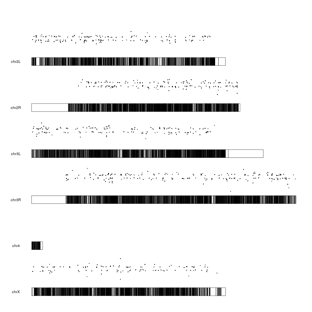
library(karyoploteR)
kp <- plotKaryotype(genome="dm6")

And we can start adding data. We can start by plotting the 10 most differentially expressed genes. We can use kpPlotMarkers for this.
ordered <- dm.genes[order(dm.genes$padj, na.last = TRUE),]
kp <- plotKaryotype(genome="dm6")
kp <- kpPlotMarkers(kp, ordered[1:10], labels = names(ordered[1:10]), text.orientation = "horizontal")

Ok, we can see the position of some of the genes, but that’s not very informative. What about getting a more general view?
We could create a plot with the p-values of all significant genes, for example. To do that, we’ll need first to transform the adjusted p-value into something that we can easily represent. A minus logarithimic transformation is the usual trick. We’ll also first filter out the genes with NA in the padj column.
filtered.dm.genes <- dm.genes[!is.na(dm.genes$padj)]
log.pval <- -log10(filtered.dm.genes$padj)
mcols(filtered.dm.genes)$log.pval <- log.pval
filtered.dm.genes
## GRanges object with 7703 ranges and 5 metadata columns:
##               seqnames            ranges strand |      log2FoldChange
##                  <Rle>         <IRanges>  <Rle> |           <numeric>
##   FBgn0000008    chr2R 22136968-22172834      + | 0.00147804699780288
##   FBgn0000017    chr3L 16615866-16647882      - |   -0.20984748963473
##   FBgn0000018    chr2L 10973443-10975293      - |  -0.087450584437327
##   FBgn0000032    chr3R 29991144-29993411      - | -0.0767713722535828
##   FBgn0000037    chr2R 24378630-24390294      - |   0.145640513826726
##           ...      ...               ...    ... .                 ...
##   FBgn0261565    chr3L 16865295-16922487      + |  -0.251235988219195
##   FBgn0261570     chrX 17710144-17752007      + |   0.257868658220044
##   FBgn0261573     chrX 19521929-19530896      + |  0.0113157859777773
##   FBgn0261574    chr3L 20005301-20024607      + |  0.0114111134835376
##   FBgn0261575    chr3R 25344761-25346921      - |  0.0188614981282305
##                              stat             pvalue              padj
##                         <numeric>          <numeric>         <numeric>
##   FBgn0000008 0.00961103232571814  0.992331623751249 0.996928193757777
##   FBgn0000017   -1.90459298025705 0.0568329997930804 0.282362591282872
##   FBgn0000018  -0.706762316967849  0.479714195948799 0.823906275813945
##   FBgn0000032  -0.622250701120678  0.533777032158315 0.849775485587922
##   FBgn0000037   0.942341378696648  0.346017889583725 0.740907356574567
##           ...                 ...                ...               ...
##   FBgn0261565   -2.09802494943952 0.0359029414645859 0.208985550074004
##   FBgn0261570    2.32596958865859 0.0200201731062224  0.14073302429315
##   FBgn0261573   0.111942463920155  0.910869026839649 0.982036667169567
##   FBgn0261574  0.0789929120830593  0.937038260785842 0.988141464356031
##   FBgn0261575   0.174204772639456  0.861704534865757 0.967913752384493
##                          log.pval
##                         <numeric>
##   FBgn0000008  0.0013361217062252
##   FBgn0000017   0.549192841173973
##   FBgn0000018  0.0841221890454697
##   FBgn0000032  0.0706958016384277
##   FBgn0000037   0.130236093024475
##           ...                 ...
##   FBgn0261565   0.679883741353413
##   FBgn0261570   0.851603979428227
##   FBgn0261573 0.00787229627403262
##   FBgn0261574  0.0051808764738463
##   FBgn0261575  0.0141633395224653
##   -------
##   seqinfo: 1870 sequences (1 circular) from dm6 genome
And now we can plot the significant genes (padj < 0.05) represented as points on the genome using the kpPoints function, with their y position determined by their pvalue.
sign.genes <- filtered.dm.genes[filtered.dm.genes$padj < 0.05,]
kp <- plotKaryotype(genome="dm6")
kpPoints(kp, data=sign.genes, y=sign.genes$log.pval)

WOW! What happened here? There are points floating everywhere!
This is due to the fact that ymin and ymax are 0 and 1 by default but our
y values are in a much larger range:
range(sign.genes$log.pval)
## [1] 1.301253 160.390812
So to tame the floating points we simply need to set ymax to the maximum value we want to plot.
sign.genes <- filtered.dm.genes[filtered.dm.genes$padj < 0.05,]
kp <- plotKaryotype(genome="dm6")
kpPoints(kp, data=sign.genes, y=sign.genes$log.pval, ymax=max(sign.genes$log.pval))

That’s better and makes more sense. We can see lots of genes with a relatively high p-value (and low -log10(pval)) and a few genes with a very small p-pvalue (and a high -log10(pval)). We cal also see how these points are in the same positions as the markers in the first plot, as expected.
The log2 of the fold change is another value we could plot. It has a smaller range and might be more suitable to be used as the y value in a scatter plot.
We’ll start studying it’s range:
range(sign.genes$log2FoldChange)
## [1] -3.697857 2.534344
We can see the values are distributted above and below 0, so we’ll have to
adjust both ymin and ymax. To make it more clear, we’ll center the 0.
fc.ymax <- ceiling(max(abs(range(sign.genes$log2FoldChange))))
fc.ymin <- -fc.ymax
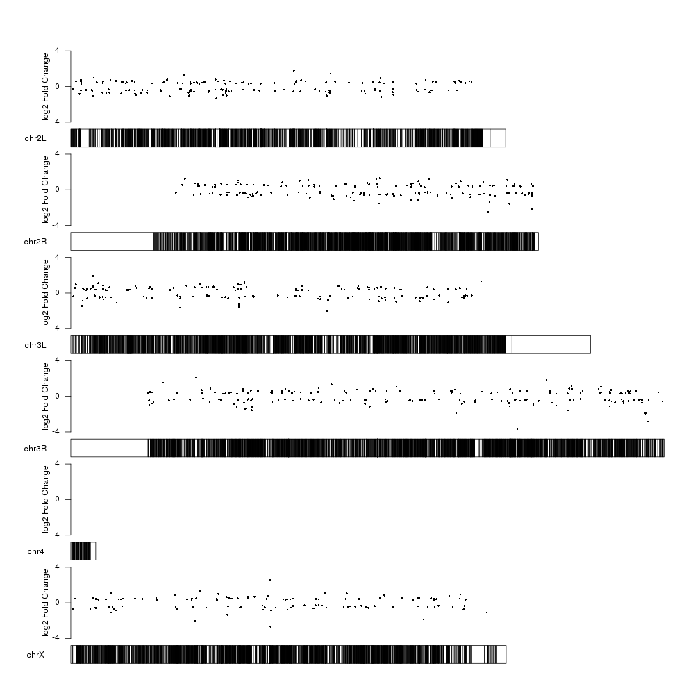
kp <- plotKaryotype(genome="dm6")
kpPoints(kp, data=sign.genes, y=sign.genes$log2FoldChange, ymax=fc.ymax, ymin=fc.ymin)
And we can add a y axis and a label to explain what the data represents.
kp <- plotKaryotype(genome="dm6")
kpPoints(kp, data=sign.genes, y=sign.genes$log2FoldChange, ymax=fc.ymax, ymin=fc.ymin)
kpAxis(kp, ymax=fc.ymax, ymin=fc.ymin)
kpAddLabels(kp, labels = "log2 Fold Change", srt=90, pos=1, label.margin = 0.04, ymax=fc.ymax, ymin=fc.ymin)
Now we can clearly see the fold changes but the significance level of the
differentially expressed genes is not represented. How can we include it into
the plot? We can use the size of the points to represent the p-value information
using the cex parameter of kpPoints. We can apply a square root to the
log pval so the area of the circle is proportional to the pval, and scale it up
or down with a fixed factor depending on the available space to improve the
perception of the data.
cex.val <- sqrt(sign.genes$log.pval)/3
kp <- plotKaryotype(genome="dm6")
kpPoints(kp, data=sign.genes, y=sign.genes$log2FoldChange, cex=cex.val, ymax=fc.ymax, ymin=fc.ymin)
kpAxis(kp, ymax=fc.ymax, ymin=fc.ymin)
kpAddLabels(kp, labels = "log2 Fold Change", srt=90, pos=1, label.margin = 0.04, ymax=fc.ymax, ymin=fc.ymin)
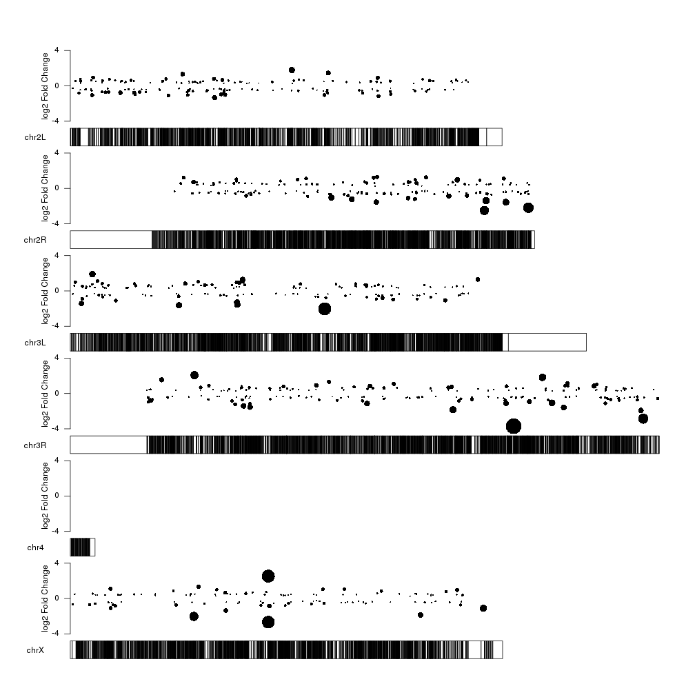
With this representation we see some interesting things such the fact that the too very close top 10 significant genes in chrX are in fact regulated in oposite directions, with one overexpressed and the other one underexpressed.
Can we combine the two plots into a single one so we get the general view plus
the name of the most significant genes? Sure! On option is to plot everything
together, with markers on top of the data points by simply adding a call to
kpPlotMarkers as in the second plot.
top.genes <- ordered[1:20]

kp <- plotKaryotype(genome="dm6")
kpPoints(kp, data=sign.genes, y=sign.genes$log2FoldChange, cex=cex.val, ymax=fc.ymax, ymin=fc.ymin)
kpAxis(kp, ymax=fc.ymax, ymin=fc.ymin)
kpAddLabels(kp, labels = "log2 Fold Change", srt=90, pos=1, label.margin = 0.04, ymax=fc.ymax, ymin=fc.ymin)
kpPlotMarkers(kp, top.genes, labels = names(top.genes), text.orientation = "horizontal")
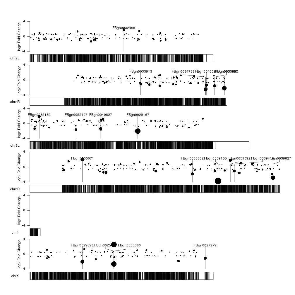
This kind of works… but it’s not very aesthetically pleasing. We can easily
separate the two representations in two different vertical areas with the r0
and r1 arguments. We can set the lower 80% of the area for the data points
telling them to finish at 0.8 with r1=0.8 and the top 20% for the markers
telling them to start at 0.8 with r0=0.8.
points.top <- 0.8
kp <- plotKaryotype(genome="dm6")
kpPoints(kp, data=sign.genes, y=sign.genes$log2FoldChange, cex=cex.val, ymax=fc.ymax, ymin=fc.ymin, r1=points.top)
kpAxis(kp, ymax=fc.ymax, ymin=fc.ymin, r1=points.top)
kpAddLabels(kp, labels = "log2 FC", srt=90, pos=1, label.margin = 0.04, ymax=fc.ymax, ymin=fc.ymin, r1=points.top)
kpPlotMarkers(kp, top.genes, labels = names(top.genes), text.orientation = "horizontal", r0=points.top)
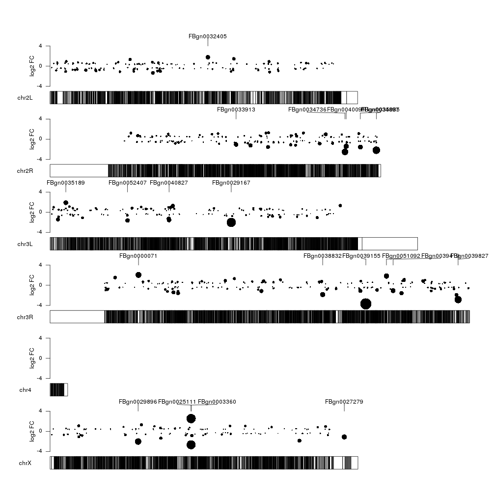
Ok, that’s better. But could extend the markers to the exact point they are
annotating? So we can visually relate them better? We cannot extend the markers
down in a non-uniform way, but we can simulate that drawing a few vertical
segments from the center of the points up to the top of the data part of the
plot. To do that we’ll set x0 and x1 to the center of the gene, y0 to the y
value as determined by the log fold change and y1 to the fc.max previously
computed.
kp <- plotKaryotype(genome="dm6")
kpPoints(kp, data=sign.genes, y=sign.genes$log2FoldChange, cex=cex.val, ymax=fc.ymax, ymin=fc.ymin, r1=points.top)
kpAxis(kp, ymax=fc.ymax, ymin=fc.ymin, r1=points.top)
kpAddLabels(kp, labels = "log2 FC", srt=90, pos=1, label.margin = 0.04, ymax=fc.ymax, ymin=fc.ymin, r1=points.top)
kpPlotMarkers(kp, top.genes, labels = names(top.genes), text.orientation = "horizontal", r0=points.top)
gene.mean <- start(top.genes) + (end(top.genes) - start(top.genes))/2
kpSegments(kp, chr=as.character(seqnames(top.genes)), x0=gene.mean, x1=gene.mean, y0=top.genes$log2FoldChange, y1=fc.ymax, ymax=fc.ymax, ymin=fc.ymin, r1=points.top)

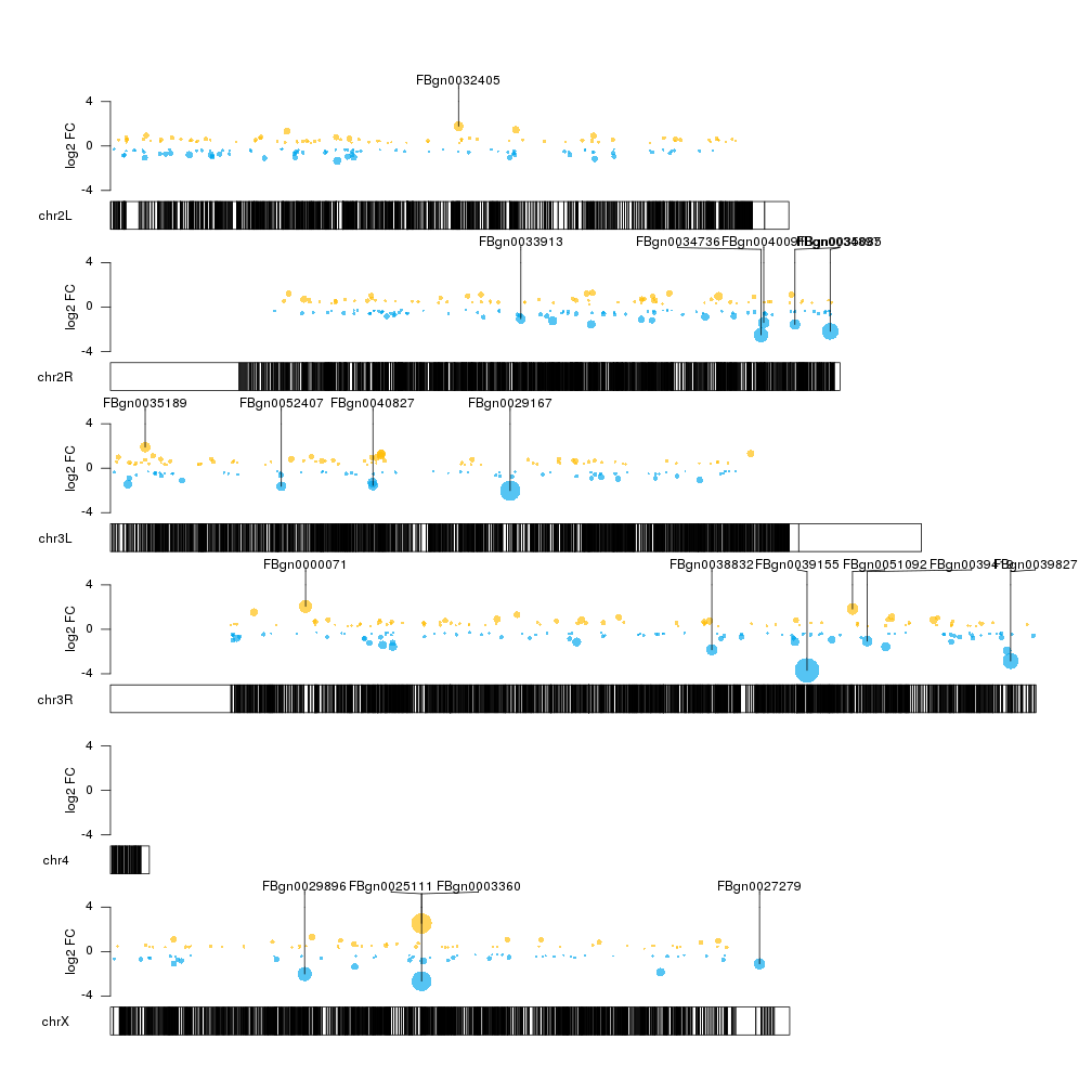
That’s better, but we could add some color to differentiate between over- and underexpressed genes. We’ll make the color partially transparent so we can see more clearly when different data points overlap.
col.over <- "#FFBD07AA"
col.under <- "#00A6EDAA"
sign.col <- rep(col.over, length(sign.genes))
sign.col[sign.genes$log2FoldChange<0] <- col.under

kp <- plotKaryotype(genome="dm6")
kpPoints(kp, data=sign.genes, y=sign.genes$log2FoldChange, cex=cex.val, ymax=fc.ymax, ymin=fc.ymin, r1=points.top, col=sign.col)
kpAxis(kp, ymax=fc.ymax, ymin=fc.ymin, r1=points.top)
kpAddLabels(kp, labels = "log2 FC", srt=90, pos=1, label.margin = 0.04, ymax=fc.ymax, ymin=fc.ymin, r1=points.top)
gene.mean <- start(top.genes) + (end(top.genes) - start(top.genes))/2
kpSegments(kp, chr=as.character(seqnames(top.genes)), x0=gene.mean, x1=gene.mean, y0=top.genes$log2FoldChange, y1=fc.ymax, ymax=fc.ymax, ymin=fc.ymin, r1=points.top)
kpPlotMarkers(kp, top.genes, labels = names(top.genes), text.orientation = "horizontal", r0=points.top)
There seems to be some regions of the genome somehow depleted of significant
genes. Is it because there are just a few genes in those regions or might be
caused by some other factor? To explore this possibility we can add a second
data panel below the ideograms (setting plot.type to 2) and plot there the
gene density.
kp <- plotKaryotype(genome="dm6", plot.type=2)
#Data panel 1
kpPoints(kp, data=sign.genes, y=sign.genes$log2FoldChange, cex=cex.val, ymax=fc.ymax, ymin=fc.ymin, r1=points.top, col=sign.col)
kpAxis(kp, ymax=fc.ymax, ymin=fc.ymin, r1=points.top)
kpAddLabels(kp, labels = "log2 FC", srt=90, pos=1, label.margin = 0.04, ymax=fc.ymax, ymin=fc.ymin, r1=points.top)
gene.mean <- start(top.genes) + (end(top.genes) - start(top.genes))/2
kpSegments(kp, chr=as.character(seqnames(top.genes)), x0=gene.mean, x1=gene.mean, y0=top.genes$log2FoldChange, y1=fc.ymax, ymax=fc.ymax, ymin=fc.ymin, r1=points.top)
kpPlotMarkers(kp, top.genes, labels = names(top.genes), text.orientation = "horizontal", r0=points.top)

#Data panel 2
kp <- kpPlotDensity(kp, data=dm.genes, window.size = 10e4, data.panel = 2)
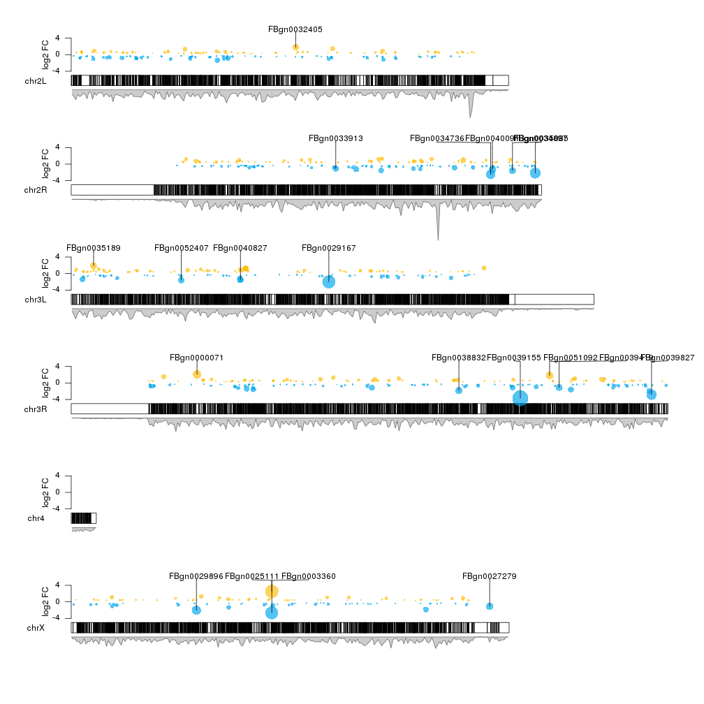
We can see that this is the case for some regions (for example the end of chrX but not for others).
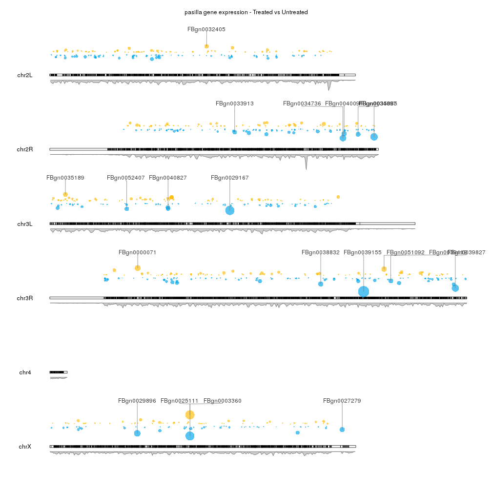
To finish up our plot we can adjust some plotting parameters to make the ideograms and the second data panel smaller and to leave some margin between the marker labels. We can also remove the axis and labels if desired, and adjust some of the colors.
pp <- getDefaultPlotParams(plot.type = 2)
pp$data2height <- 75
pp$ideogramheight <- 10
kp <- plotKaryotype(genome="dm6", plot.type=2, plot.params = pp)
kpAddMainTitle(kp, main = "pasilla gene expression - Treated vs Untreated")
#Data panel 1
kpPoints(kp, data=sign.genes, y=sign.genes$log2FoldChange, cex=cex.val, ymax=fc.ymax, ymin=fc.ymin, r1=points.top, col=sign.col)
gene.mean <- start(top.genes) + (end(top.genes) - start(top.genes))/2
kpSegments(kp, chr=as.character(seqnames(top.genes)), x0=gene.mean, x1=gene.mean, y0=top.genes$log2FoldChange, y1=fc.ymax, ymax=fc.ymax, ymin=fc.ymin, r1=points.top, col="#777777")
kpPlotMarkers(kp, top.genes, labels = names(top.genes), text.orientation = "horizontal", r0=points.top, label.dist = 0.008, label.color="#444444", line.color = "#777777")

#Data panel 2
kp <- kpPlotDensity(kp, data=dm.genes, window.size = 10e4, data.panel = 2)