Plot the nucleotide composition of the genome
In this example we’ll create a plot representing the proportion of each
nucleotide along the genome. Plotting this kind of data usually only makes sense
for small regions, so we’ll use zoom to restrict the plot to a small
part of the genome (in this case, the APC gene region). We’ll also add
CpG islands location in the genome to see how they relate to the CG sequence
content.
Data
In this examples we’ll use data from different sources:
- Sequence: To obtain the genomic sequence of the human genome version GRCh37 we’ll use the BSgenome.Hsapiens.UCSC.hg19 package, based on data from UCSC
- Gene Structure: To plot the APC gene we’ll need a
TxDbobject as expected by thekpPlotGenesfunction. In this case we’ll use data from UCSC available on the TxDb.Hsapiens.UCSC.hg19.knownGene package. - CpG Islands: To get the CpG Islands we’ll use the AnnotationHub R package. You can find more information on how to search and retrieve data with the annotation hub in its vignette and in the rtracklayer’s import documentation
Let’s start
We’ll start loading the required libraries and loading the CpG islands from
AnnotationHub. The CpG Islands are the source with identifier AH5086.
Refer to the
AnnotationHub vignette
to find out how to explore the available annotation sources.
library(karyoploteR)

library(BSgenome.Hsapiens.UCSC.hg19)
library(TxDb.Hsapiens.UCSC.hg19.knownGene)
library(AnnotationHub)

ahub <- AnnotationHub()
cpg.islands <- ahub[["AH5086"]]
And defining some variables we’ll need: the bases in the order we’ll plot them and a color for each one of them (we’ll use the standrad sanger derived colors).
bases <- c("C", "G", "A", "T")
base.colors <- setNames(c("#32C0F2", "#FFCC32", "#32C172", "#FE3231"), bases)
We can now use regioneR’s
toGRanges function to create a GenomicRanges object with the region we want
to plot (a genomic region containing APC), and partition this region into
multiple non-overlaping tiles with the tile function from the GenomicRanges
package. We’ll set the tile width to 1000 bases. We’ll use unlist to convert
GRangesList returned by tile into a GRanges.
APC.loci <- toGRanges("chr5:112035000-112190000", genome = "hg19")

tiles <- tile(x = APC.loci, width = 1000)
tiles <- unlist(tiles)
tiles
## GRanges object with 156 ranges and 0 metadata columns:
##         seqnames              ranges strand
##            <Rle>           <IRanges>  <Rle>
##     [1]     chr5 112035000-112035992      *
##     [2]     chr5 112035993-112036986      *
##     [3]     chr5 112036987-112037979      *
##     [4]     chr5 112037980-112038973      *
##     [5]     chr5 112038974-112039966      *
##     ...      ...                 ...    ...
##   [152]     chr5 112185033-112186025      *
##   [153]     chr5 112186026-112187019      *
##   [154]     chr5 112187020-112188012      *
##   [155]     chr5 112188013-112189006      *
##   [156]     chr5 112189007-112190000      *
##   -------
##   seqinfo: 93 sequences from an unspecified genome; no seqlengths
The next step is to get the genomic sequence of each of these tiles and
count the number of times we see each nucleotide. We can use
getSeq
to extract the sequence for every tile and us the alphabetFrequency function
to count the nucleotides.
Then, to get the frequencies we’ll divide each count with the total number of
bases in each tile (we can get that value with rowSums) and attach the
nucleotide frequencies to the tiles GRanges. When doing that we’ll select
the columns explicitly to ensure they are in the order we want.
seqs <- getSeq(BSgenome.Hsapiens.UCSC.hg19, tiles)
counts <- alphabetFrequency(seqs, baseOnly=TRUE)
freqs <- counts/rowSums(counts)

mcols(tiles) <- DataFrame(freqs[,bases])
tiles
## GRanges object with 156 ranges and 4 metadata columns:
##         seqnames              ranges strand |                 C
##            <Rle>           <IRanges>  <Rle> |         <numeric>
##     [1]     chr5 112035000-112035992      * | 0.188318227593152
##     [2]     chr5 112035993-112036986      * | 0.153923541247485
##     [3]     chr5 112036987-112037979      * | 0.190332326283988
##     [4]     chr5 112037980-112038973      * | 0.211267605633803
##     [5]     chr5 112038974-112039966      * | 0.228600201409869
##     ...      ...                 ...    ... .               ...
##   [152]     chr5 112185033-112186025      * | 0.154078549848943
##   [153]     chr5 112186026-112187019      * | 0.208249496981891
##   [154]     chr5 112187020-112188012      * | 0.172205438066465
##   [155]     chr5 112188013-112189006      * | 0.212273641851107
##   [156]     chr5 112189007-112190000      * | 0.195171026156942
##                         G                 A                 T
##                 <numeric>         <numeric>         <numeric>
##     [1] 0.195367573011078 0.222557905337362 0.393756294058409
##     [2] 0.165995975855131 0.314889336016097 0.365191146881288
##     [3] 0.179254783484391 0.350453172205438 0.279959718026183
##     [4] 0.163983903420523 0.290744466800805 0.334004024144869
##     [5] 0.210473313192346 0.235649546827795  0.32527693856999
##     ...               ...               ...               ...
##   [152] 0.185297079556898 0.381671701913394 0.278952668680765
##   [153] 0.182092555331992   0.3158953722334 0.293762575452716
##   [154] 0.241691842900302 0.310171198388721 0.275931520644512
##   [155] 0.189134808853119  0.28169014084507 0.316901408450704
##   [156] 0.228370221327968 0.301810865191147 0.274647887323944
##   -------
##   seqinfo: 93 sequences from an unspecified genome; no seqlengths
With that we can now start plotting! We’ll use the zoom parameter to
create a plot representing a small portion of the genome
and then we can use kpLines to plot the frequency of a nucleotide along the genome.
kp <- plotKaryotype(zoom=APC.loci)
kpLines(kp, data=tiles, y=tiles$A)
And we can use the same strategy to plot the frequency of each nucleotide at the same time. To differentiate the lines we’ll plot them in the nucleotide colors.
kp <- plotKaryotype(zoom=APC.loci)
kpLines(kp, data=tiles, y=tiles$A, col=base.colors["A"])
kpLines(kp, data=tiles, y=tiles$T, col=base.colors["T"])
kpLines(kp, data=tiles, y=tiles$C, col=base.colors["C"])
kpLines(kp, data=tiles, y=tiles$G, col=base.colors["G"])
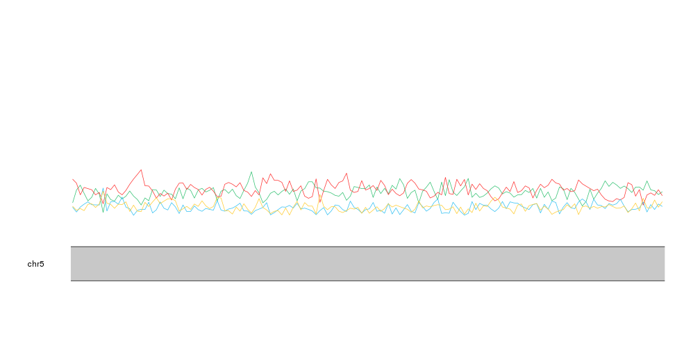
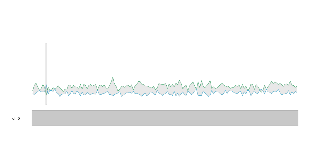
With that we can see that A and T are mor frequent than C and G, as expected and
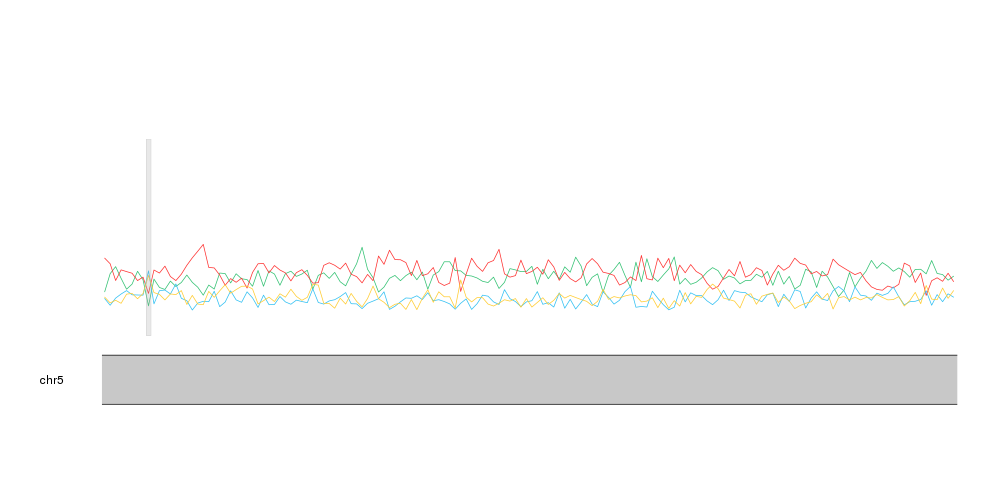
we can identify small regions where this relation changes. If we plot the
CpG islands with kpPlotRegions using a transparent grey color we can see that the only CpG
island in this region overlaps the region with highest proportion of C and G.
kp <- plotKaryotype(zoom=APC.loci)
kpLines(kp, data=tiles, y=tiles$A, col=base.colors["A"])
kpLines(kp, data=tiles, y=tiles$T, col=base.colors["T"])
kpLines(kp, data=tiles, y=tiles$C, col=base.colors["C"])
kpLines(kp, data=tiles, y=tiles$G, col=base.colors["G"])

kpPlotRegions(kp, data=cpg.islands, col="#AAAAAA44")
This representation, however, might not be the best to represent proportions. A stacked area graph can represent this kind of data in a slightly different way where it’s clear that the values represent a proportion over a total.
karyoploteR does not include a stacked area graph, but we can build it with
a bit of precomputation and using the kpPlotRibbon function. A ribbon is
a variable width polygon defined by two lines, y0 and y1.
As an example of ribbon we can plot the distance between the A frequency and the C frequency.
kp <- plotKaryotype(zoom=APC.loci)
kpPlotRibbon(kp, data=tiles, y0=tiles$C, y1=tiles$A, col="#AAAAAA44")
kpLines(kp, data=tiles, y=tiles$A, col=base.colors["A"])
kpLines(kp, data=tiles, y=tiles$C, col=base.colors["C"])


kpPlotRegions(kp, data=cpg.islands, col="#AAAAAA44")
Now, to create a stacked area plot we’ll need to stack one ribbon per
nucleotide, one on top of each other, with the cumulative sum of the frequencies
of the bases below it as y0 and y1. We can use lapply and the cumsum
function to compute the cumulative sums for each tile.
cum.sums <- lapply(seq_len(length(tiles)),
                   function(i) {
                     return(cumsum(as.numeric(data.frame(mcols(tiles))[i,c(1:4)])))
                  })
cum.sums <- do.call(rbind, cum.sums)
cum.sums <- data.frame(cum.sums)
names(cum.sums) <- bases
head(cum.sums)
##           C         G         A T
## 1 0.1883182 0.3836858 0.6062437 1
## 2 0.1539235 0.3199195 0.6348089 1
## 3 0.1903323 0.3695871 0.7200403 1
## 4 0.2112676 0.3752515 0.6659960 1
## 5 0.2286002 0.4390735 0.6747231 1
## 6 0.2072435 0.4215292 0.6830986 1
As expected, the cumulative sum of the frequencies for the last nucleotide, T, is 1.
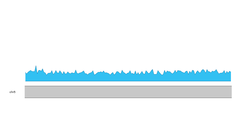
We can now use this data to plot the ribbons. First, we’ll start with the C frequency. In this case it will go from 0 to the frequency of C.
kp <- plotKaryotype(zoom=APC.loci)
kpPlotRibbon(kp, data=tiles, y0=0, y1=cum.sums$C, col=base.colors["C"])
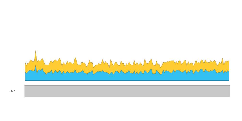
Then, we can add the next nucleotide, G, going from the frequency of C to the frequency of C plus G.
kp <- plotKaryotype(zoom=APC.loci)
kpPlotRibbon(kp, data=tiles, y0=0, y1=cum.sums$C, col=base.colors["C"])
kpPlotRibbon(kp, data=tiles, y0=cum.sums$C, y1=cum.sums$G, col=base.colors["G"])
And we can do the same with A and T
kp <- plotKaryotype(zoom=APC.loci)
kpPlotRibbon(kp, data=tiles, y0=0, y1=cum.sums$C, col=base.colors["C"])
kpPlotRibbon(kp, data=tiles, y0=cum.sums$C, y1=cum.sums$G, col=base.colors["G"])
kpPlotRibbon(kp, data=tiles, y0=cum.sums$G, y1=cum.sums$A, col=base.colors["A"])
kpPlotRibbon(kp, data=tiles, y0=cum.sums$A, y1=cum.sums$T, col=base.colors["T"])
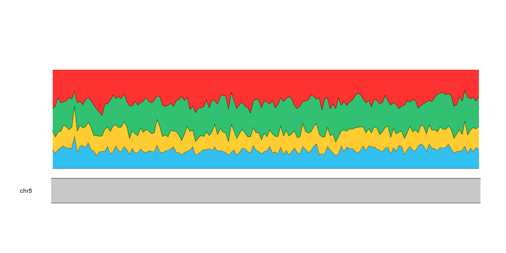
And with that we have our stacked area plot representing the frequencies of the different nucleotides.
To help the reader understand our plot we can add labels to the left of the plot indicating the nucleotide represented. We’ll position the labels automatically using the nucleotide frequencies of the first tile.
kp <- plotKaryotype(zoom=APC.loci)

kpPlotRibbon(kp, data=tiles, y0=0, y1=cum.sums$C, col=base.colors["C"])
kpPlotRibbon(kp, data=tiles, y0=cum.sums$C, y1=cum.sums$G, col=base.colors["G"])
kpPlotRibbon(kp, data=tiles, y0=cum.sums$G, y1=cum.sums$A, col=base.colors["A"])
kpPlotRibbon(kp, data=tiles, y0=cum.sums$A, y1=cum.sums$T, col=base.colors["T"])

kpAddLabels(kp, r0 = 0, r1=cum.sums$C[1], labels = "C")
kpAddLabels(kp, r0 = cum.sums$C[1], r1=cum.sums$G[1], labels = "G")
kpAddLabels(kp, r0 = cum.sums$G[1], r1=cum.sums$A[1], labels = "A")
kpAddLabels(kp, r0 = cum.sums$A[1], r1=cum.sums$T[1], labels = "T")

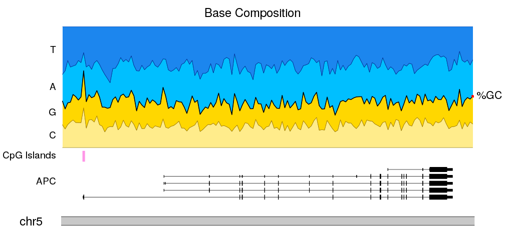
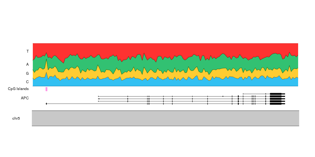
And to give it some context, we can add the transcript structure of the
APC gene and the location of the CpG islands. To do that we’ll set r0
of the ribbons to 0.3 and add the gene and the islands in the space between
0 and 0.3. We’ll have to update the computation of the vertical label position
to reflect this. To add the gene we’ll use the kpPlotGenes function passing it
the TxDb object loaded at the beginning.
bc.r0 <- 0.30

kp <- plotKaryotype(zoom = APC.loci)

kpPlotGenes(kp, data = TxDb.Hsapiens.UCSC.hg19.knownGene, r0=0, r1=0.2, add.gene.names = FALSE, add.transcript.names = FALSE, add.strand.marks = FALSE)
kpAddLabels(kp, r1=0.2, labels = "APC")

kpPlotRegions(kp, cpg.islands, r0=0.22, r1=0.28, col="#FF66DDAA")
kpAddLabels(kp, r0=0.22, r1=0.28, labels = "CpG Islands")

kpPlotRibbon(kp, data=tiles, y0 = 0, y1=cum.sums$C, col=base.colors["C"], r0=bc.r0)
kpPlotRibbon(kp, data=tiles, y0 = cum.sums$C, y1=cum.sums$G, col=base.colors["G"], r0=bc.r0)
kpPlotRibbon(kp, data=tiles, y0 = cum.sums$G, y1=cum.sums$A, col=base.colors["A"], r0=bc.r0)
kpPlotRibbon(kp, data=tiles, y0 = cum.sums$A, y1=cum.sums$T, col=base.colors["T"], r0=bc.r0)

kpAddLabels(kp, r0 = bc.r0, r1=bc.r0 + cum.sums$C[1]*(1 - bc.r0), labels = "C")
kpAddLabels(kp, r0 = bc.r0 + cum.sums$C[1]*(1 - bc.r0), r1=bc.r0 + cum.sums$G[1]*(1 - bc.r0), labels = "G")
kpAddLabels(kp, r0 = bc.r0 + cum.sums$G[1]*(1 - bc.r0), r1=bc.r0 + cum.sums$A[1]*(1 - bc.r0), labels = "A")
kpAddLabels(kp, r0 = bc.r0 + cum.sums$A[1]*(1 - bc.r0), r1=bc.r0 + cum.sums$T[1]*(1 - bc.r0), labels = "T")
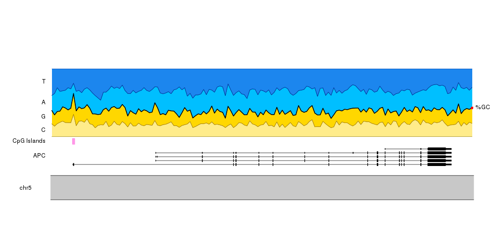
If instead of the contribution of each nucleotide to the sequence we want to
stress the GC content, we can add a line delimiting the space between CG and AT
and a label on the right side using kpText. Since the text will be plotted out
of the data panel we’ll need to set clipping to false.
In addition, changing the colors so G and C (and T and A) have similar colors
will help us on this.
base.colors <- setNames(c("#FFEC8B", "#FFD700", "#00BFFF", "#1C86EE"), bases)

kp <- plotKaryotype(zoom = APC.loci)

kpPlotGenes(kp, data = TxDb.Hsapiens.UCSC.hg19.knownGene, r0=0, r1=0.2, add.gene.names = FALSE, add.transcript.names = FALSE, add.strand.marks = FALSE)
kpAddLabels(kp, r1=0.2, labels = "APC")

kpPlotRegions(kp, cpg.islands, r0=0.22, r1=0.28, col="#FF66DDAA")
kpAddLabels(kp, r0=0.22, r1=0.28, labels = "CpG Islands")

kpPlotRibbon(kp, data=tiles, y0 = 0, y1=cum.sums$C, col=base.colors["C"], r0=bc.r0)
kpPlotRibbon(kp, data=tiles, y0 = cum.sums$C, y1=cum.sums$G, col=base.colors["G"], r0=bc.r0)
kpPlotRibbon(kp, data=tiles, y0 = cum.sums$G, y1=cum.sums$A, col=base.colors["A"], r0=bc.r0)
kpPlotRibbon(kp, data=tiles, y0 = cum.sums$A, y1=cum.sums$T, col=base.colors["T"], r0=bc.r0)

kpLines(kp, data=tiles, y=cum.sums$G, lwd=2, r0=bc.r0)

kpAddLabels(kp, r0 = bc.r0, r1=bc.r0 + cum.sums$C[1]*(1 - bc.r0), labels = "C")
kpAddLabels(kp, r0 = bc.r0 + cum.sums$C[1]*(1 - bc.r0), r1=bc.r0 + cum.sums$G[1]*(1 - bc.r0), labels = "G")
kpAddLabels(kp, r0 = bc.r0 + cum.sums$G[1]*(1 - bc.r0), r1=bc.r0 + cum.sums$A[1]*(1 - bc.r0), labels = "A")
kpAddLabels(kp, r0 = bc.r0 + cum.sums$A[1]*(1 - bc.r0), r1=bc.r0 + cum.sums$T[1]*(1 - bc.r0), labels = "T")

kpText(kp, data=tiles[length(tiles)], y=cum.sums$G[nrow(cum.sums)], r0=bc.r0, labels = "%GC", pos=4, clipping=FALSE)
kpPoints(kp, cex=1, col="red", data=tiles[length(tiles)], y=cum.sums$G[nrow(cum.sums)], r0=bc.r0, clipping=FALSE)
And to finish it up, we will adjust the plot params to reduce the top and bottom margins and to shrink the ideogram. We’ll also add a main title and adjust the font sizes.
pp <- getDefaultPlotParams(1)
pp$ideogramheight <- 10
pp$topmargin <- 30
pp$bottommargin <- 30
pp$data1outmargin <- 0
pp$leftmargin <- 0.12
pp$rightmargin <- 0.06

bc.r0 <- 0.30

kp <- plotKaryotype(zoom = APC.loci, main="Base Composition", plot.params = pp, cex=2)


kpPlotGenes(kp, data = TxDb.Hsapiens.UCSC.hg19.knownGene, r0=0, r1=0.2, add.gene.names = FALSE, add.transcript.names = FALSE, add.strand.marks = FALSE)
kpAddLabels(kp, r1=0.2, labels = "APC", cex=1.6)

kpPlotRegions(kp, cpg.islands, r0=0.22, r1=0.28, col="#FF66DDAA")
kpAddLabels(kp, r0=0.22, r1=0.28, labels = "CpG Islands", cex=1.6)

kpPlotRibbon(kp, data=tiles, y0 = 0, y1=cum.sums$C, col=base.colors["C"], r0=bc.r0)
kpPlotRibbon(kp, data=tiles, y0 = cum.sums$C, y1=cum.sums$G, col=base.colors["G"], r0=bc.r0)
kpPlotRibbon(kp, data=tiles, y0 = cum.sums$G, y1=cum.sums$A, col=base.colors["A"], r0=bc.r0)
kpPlotRibbon(kp, data=tiles, y0 = cum.sums$A, y1=cum.sums$T, col=base.colors["T"], r0=bc.r0)

kpLines(kp, data=tiles, y=cum.sums$G, lwd=2, r0=bc.r0)

kpAddLabels(kp, r0 = bc.r0, r1=bc.r0 + cum.sums$C[1]*(1 - bc.r0), labels = "C", cex=1.6)
kpAddLabels(kp, r0 = bc.r0 + cum.sums$C[1]*(1 - bc.r0), r1=bc.r0 + cum.sums$G[1]*(1 - bc.r0), labels = "G", cex=1.6)
kpAddLabels(kp, r0 = bc.r0 + cum.sums$G[1]*(1 - bc.r0), r1=bc.r0 + cum.sums$A[1]*(1 - bc.r0), labels = "A", cex=1.6)
kpAddLabels(kp, r0 = bc.r0 + cum.sums$A[1]*(1 - bc.r0), r1=bc.r0 + cum.sums$T[1]*(1 - bc.r0), labels = "T", cex=1.6)

kpText(kp, data=tiles[length(tiles)], y=cum.sums$G[nrow(cum.sums)], r0=bc.r0, labels = "%GC", pos=4, clipping=FALSE, cex=1.8)
kpPoints(kp, cex=1, col="red", data=tiles[length(tiles)], y=cum.sums$G[nrow(cum.sums)], r0=bc.r0,  clipping=FALSE)