Gene Density
This example shows how to plot the density of genes along the genome. We’ll need the position of all human genes and we’ll get it from the TxDb.Hsapiens.UCSC.hg19.knownGene Bioconductor package.
We’ll start by using the genes function to create a GRanges object
with all genes.
library(TxDb.Hsapiens.UCSC.hg19.knownGene)
txdb <- TxDb.Hsapiens.UCSC.hg19.knownGene
all.genes <- genes(txdb)
head(all.genes)
## GRanges object with 6 ranges and 1 metadata column:
##             seqnames              ranges strand |     gene_id
##                <Rle>           <IRanges>  <Rle> | <character>
##           1    chr19   58858172-58874214      - |           1
##          10     chr8   18248755-18258723      + |          10
##         100    chr20   43248163-43280376      - |         100
##        1000    chr18   25530930-25757445      - |        1000
##       10000     chr1 243651535-244006886      - |       10000
##   100008586     chrX   49217763-49233491      + |   100008586
##   -------
##   seqinfo: 93 sequences (1 circular) from hg19 genome
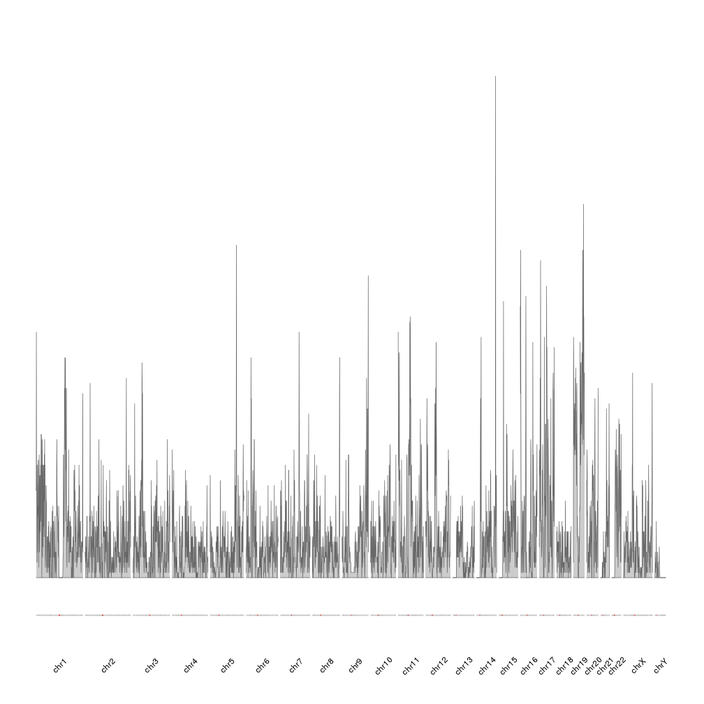
To plot the density of the genes we’ll use karyoploteR’s kpPlotDensity,
a function that computed the density of a GRanges object over the genome
and plots it.
library(karyoploteR)
kp <- plotKaryotype(genome="hg19")
kp <- kpPlotDensity(kp, all.genes)
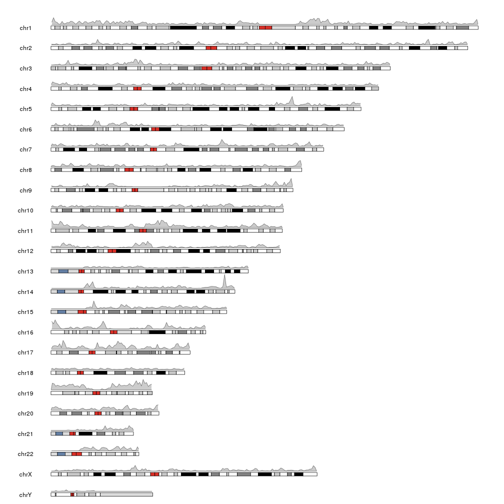
This plot is correct and has the information we need, but it would be nice to ba able to compare the density of the different chromosomes by having them one next to the other in a single line. We can achieve this simply changing the plot.type to 3, 4 or 5. In our case we’ll use plot.type=4, the plot with the ideogram on the bottom of the plot and the data above it. More information about the available plot types can be found at the vignette. We will also omit the default creation of the ideograms and chromosome labels and explicitly call the functions to better control their look.
kp <- plotKaryotype(genome="hg19", plot.type=4, ideogram.plotter = NULL, labels.plotter = NULL)
kpAddCytobandsAsLine(kp)
kpAddChromosomeNames(kp, srt=45)
kpPlotDensity(kp, all.genes)
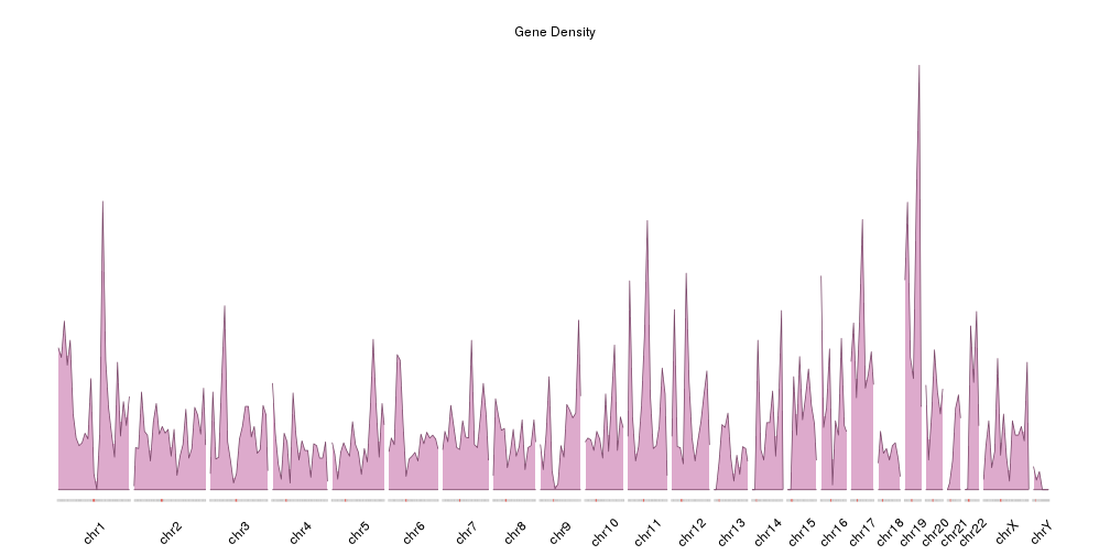
It is now easier to compare the density between the chromosomes, but the data is maybe too “spyky” for a genome-wide view. We can smooth it using a larger window size in the density computation. For example we can set window.size to 10Mb instead of the default 1Mb. In addition we’ll adjust the plotting parameters to reduce some of the blank space. In addition we’ll make the plot height smaller to get a more adequate aspect ratio.
pp <- getDefaultPlotParams(plot.type = 4)
pp$data1inmargin <- 0
pp$bottommargin <- 20

kp <- plotKaryotype(genome="hg19", plot.type=4, ideogram.plotter = NULL,
                    labels.plotter = NULL, plot.params = pp,
                    main="Gene Density")
kpAddCytobandsAsLine(kp)
kpAddChromosomeNames(kp, srt=45)
kpPlotDensity(kp, all.genes, window.size = 10e6, col="#ddaacc")