Plotting Bars
The kpBars function is based on and very similar to kpRect. It’s used to
represent values as bars of a given height. By default, the bars will start at
y=0, but it’s possible to change that and make them start at a
different value.
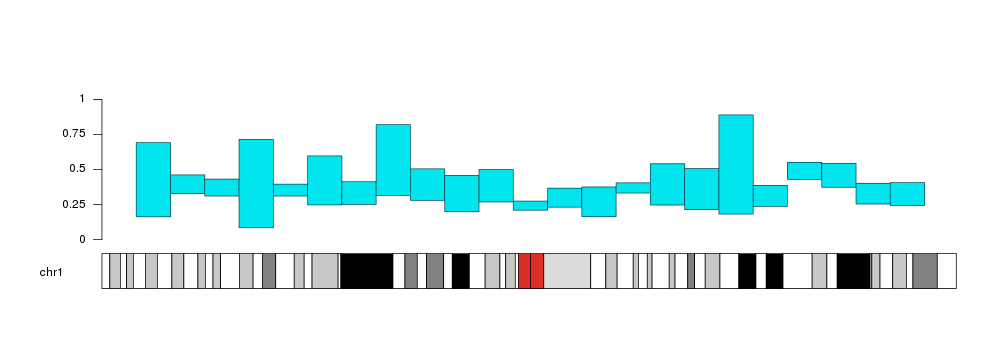
x0 <- 1:23*10e6
x1 <- 2:24*10e6
y1 <- rnorm(23, mean=0.6, sd=0.1)

kp <- plotKaryotype(chromosomes="chr1")
kpBars(kp, chr="chr1", x0=x0, x1=x1, y1=y1)
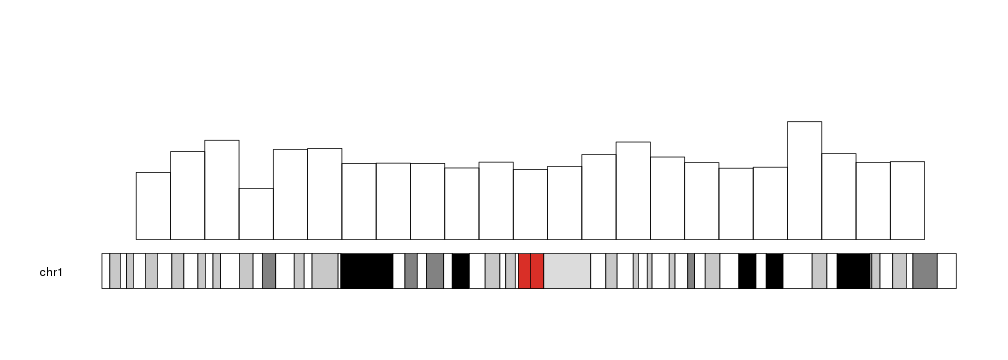
The bars can be customized with the same
graphical parameters
as in the R base graphics rect function: border, lty, col… Taking into
account that to produce bars without border we need border=NA (and not
border=NULL).
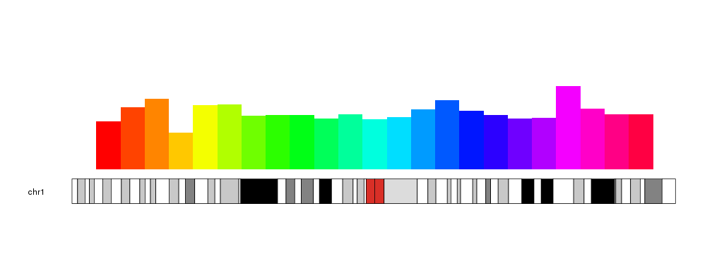
kp <- plotKaryotype(chromosomes="chr1")
kpBars(kp, chr="chr1", x0=x0, x1=x1, y1=y1, col=rainbow(23), border=NA)
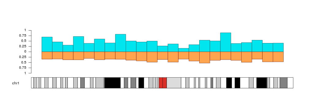
With r0 and r1 we can change their plotting region and even invert the bars, wich might be usefull to compare two distributions.
a.y1 <- rnorm(23, mean=0.6, sd=0.2)
b.y1 <- rnorm(23, mean=0.4, sd=0.05)

kp <- plotKaryotype(chromosomes="chr1")
kpAxis(kp, r0=0.5, r1=1, tick.pos = c(0, 0.25, 0.5, 0.75, 1))
kpAxis(kp, r0=0.5, r1=0,  tick.pos = c(0.25, 0.5, 0.75, 1))
kpBars(kp, chr="chr1", x0=x0, x1=x1, y1=a.y1, col="#00E5EE", border=darker("#00E5EE"), r0=0.5, r1=1)
kpBars(kp, chr="chr1", x0=x0, x1=x1, y1=b.y1, col="#FFA54F", border=darker("#FFA54F"), r0=0.5, r1=0)
Bars can start at a different value than 0. We can use y0 to set the starting point.
y0 <- y1 - rnorm(23, mean=0.3, sd=0.05)

kp <- plotKaryotype(chromosomes="chr1")
kpAxis(kp, tick.pos = c(0, 0.25, 0.5, 0.75, 1))
kpBars(kp, chr="chr1", x0=x0, x1=x1, y1=a.y1, y0=y0, col="#00E5EE", border=darker("#00E5EE"))