Multiple Data Types
In this example we will use the Bioconductor package regioneR to create different sets of genomic regions and positions representing different data types: a small set of large regions, a number of point positions in the genome representing some kind of numeric value (expression, methylation…), a small number of positions with labels to be used as markers and a set of overlapping medium regions to be plotted as sequencing reads. In addition to regioneR and rakyoploteR we will use the zoo package to compute the rolling meand and sd of the data points.
Data Creation
We will use different calls to createRandomRegions from regioneR to create the random positions and regions in the genome and calls to runif and rnorm to create the data values:
library(karyoploteR)
library(regioneR)
library(zoo)

set.seed(1234)

#Parameters
  data.points.colors <- c("#FFBD07", "#00A6ED",  "#FF3366", "#8EA604", "#C200FB")

  num.data.points <- 3000
  num.big.regions.up <- 30
  num.big.regions.down <- 30

  num.mid.regions <- 6000

  num.marks <- 90

#Create the random fake data

  #Big regions
  big.regs.up <- joinRegions(createRandomRegions(nregions = num.big.regions.up, length.mean = 20000000, length.sd = 10000000, non.overlapping = TRUE, mask=NA), min.dist = 1)
  big.regs.down <- joinRegions(createRandomRegions(nregions = num.big.regions.down, length.mean = 10000000, length.sd = 5000000, non.overlapping = TRUE, mask=big.regs.up), min.dist = 1)

  #Data points
  data.points <- createRandomRegions(nregions = num.data.points, length.mean = 1, length.sd = 0, non.overlapping = TRUE, mask=NA)
  mcols(data.points) <- data.frame(y=rnorm(n = num.data.points, 0.5, sd = 0.1))
  dp.colors <- sample(head(data.points.colors, 2), size = num.data.points, replace = TRUE)

  #and move the data points with the big regions
  data.points[overlapsAny(data.points, big.regs.up)]$y <- data.points[overlapsAny(data.points, big.regs.up)]$y + runif(n=numOverlaps(data.points, big.regs.up), min = 0.1, max=0.3)
  data.points[overlapsAny(data.points, big.regs.down)]$y <- data.points[overlapsAny(data.points, big.regs.down)]$y - runif(n=numOverlaps(data.points, big.regs.down), min = 0.1, max=0.3)

  #markers
  marks <- createRandomRegions(nregions = num.marks, length.mean = 1, length.sd = 0)
  mcols(marks) <- data.frame(labels=paste0("rs", floor(runif(num.marks, min = 10000, max=99999))))

  #medium regions
  mid.regs <- createRandomRegions(nregions = num.mid.regions, length.mean = 5000000, length.sd = 1000000, non.overlapping = FALSE)
Plotting
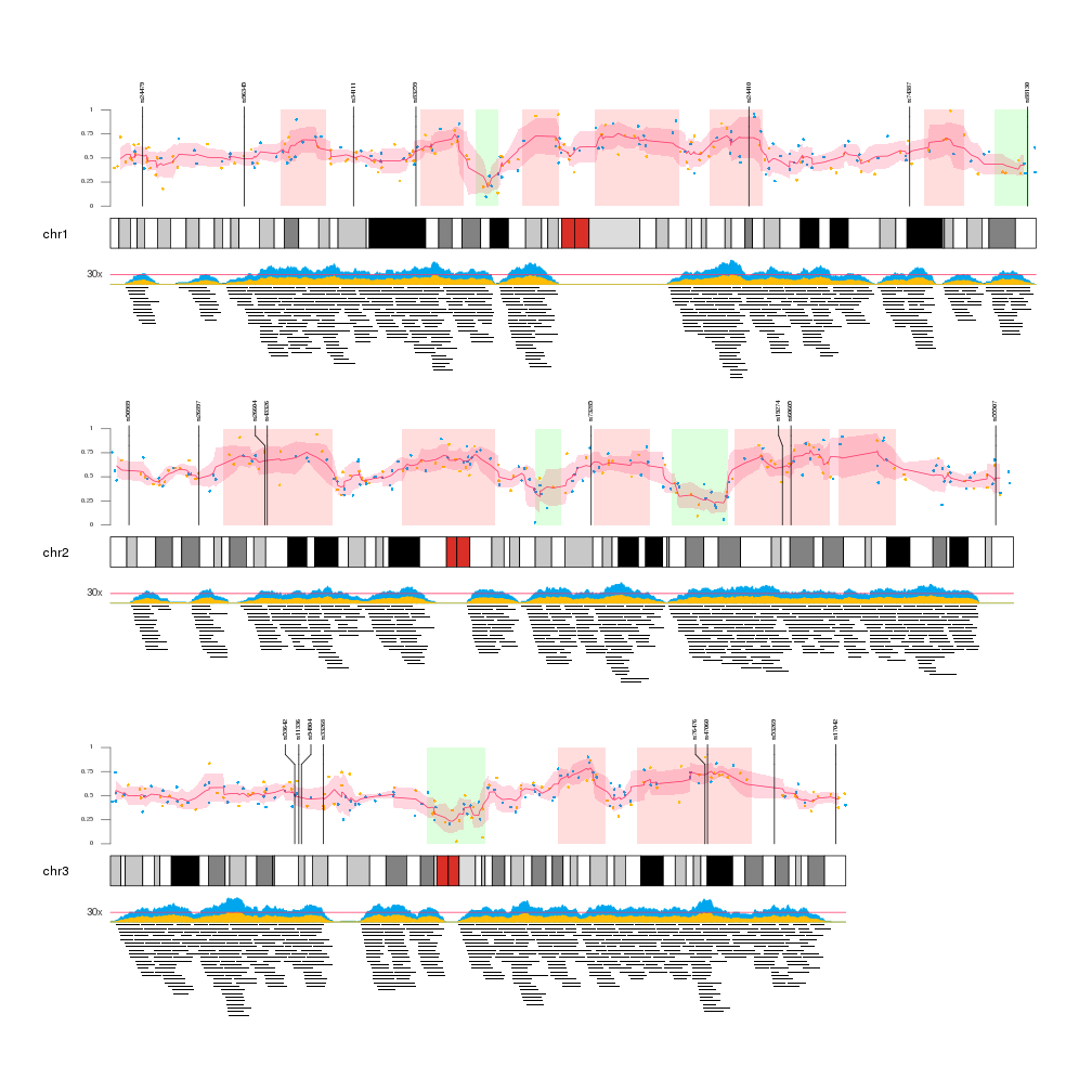
Once we have all the data available we can start plotting it. We will create a Karyoplot of the human genome with 2 data panels, one over and one below the ideogram. In order to better see the data we will create a karyoplot with only 3 chromosomes.
Data Panel 1
In the data panel 1, the top one, we will plot the big regions and the data points going from the ideogram r0=0 to 80% of the panel r1=0.8 and we’ll use the top 20% (r0=0.8, r1=1) to plot the markers.
So we’ll plot the big regions as rectangles using kpRect. We want them to span all the vertical space (y0=0, y1=1) in the first 80% of the panel (r0=0, r1=0.8) and to have no border (border=NA).
After that we will plot the data points with kpPoints in the exact same region as the rectangles. In addition, we will add an axis.
Once the data points are plotted, we will add the mean and sd of the data points. We’ll do that chromosome per chromosome since the rollmean and rollaply functions from zoo do not understand about chromosome separation. The mean will be plotted with kpLines and the sd around the mean with a call to kpPlotRibbon, that plots a variable width polygon from y0 to y1.
Finally, the markers will be plotted with a call to kpPlotMarkers, setting r1=1.1 so the tip the marker lines end slightly over the top of the big regions. With this function the marker labels will be moved as necessary to avoid label overlapping.
Data Panel 2
In the data panel 2 we’ll plot the medium regions in the 80% of the data panel furthest from the ideogram (r0=0.2, r1=1) and the coverage of these regions in the closest 20%.
To plot the regions we’ll use the kpPlotRegions function, that automatically piles up overlapping regions.
To plot the coverage we’ll user the kpPlotCoverage that given a set of regions computes the coverage and plots it as an area plot. By default the coverage would have had the base on the ideogram side, since all data panels are oriented from the ideogram out. Since we want the coverage to be inverted, we can simply flip the r0 and r1 values (r0=0.2, r1=0) and the plot will be flipped. This is a very useful trick to invert the plotting coordinates.
Finally, we add a horizontal bar depicting a fake 30x level with kpAbline and add a text label outside the data panel margins with a simple kpText.
  kp <- plotKaryotype(plot.type = 2, chromosomes = c("chr1", "chr2", "chr3"))

  ### Data Panel 1 ###

  #Big regions
  kpRect(kp, data = big.regs.up, y0=0, y1=1, col="#FFDDDD", border=NA, r0=0, r1=0.8)
  kpRect(kp, data = big.regs.down, y0=0, y1=1, col="#DDFFDD", border=NA, r0=0, r1=0.8)

  #Data points
  kpAxis(kp, ymin = 0, ymax = 1, r0=0, r1=0.8, numticks = 5, col="#666666", cex=0.5)
  kpPoints(kp, data=data.points, pch=16, cex=0.5, col=dp.colors, r0=0, r1=0.8)

  #Mean and sd of the data points.
  for(chr in seqlevels(kp$genome)) {
    chr.dp <- sort(keepSeqlevels(x = data.points, value = chr, pruning.mode = "coarse"))
    rmean <- rollmean(chr.dp$y, k = 6, align = "center")
    rsd <- rollapply(data = chr.dp$y, FUN=sd, width=6)
    kpLines(kp, chr = chr, x=start(chr.dp)[3:(length(chr.dp)-3)], y=rmean, col=data.points.colors[3], r0=0, r1=0.8)
    kpPlotRibbon(kp, chr=chr, data=chr.dp[3:(length(chr.dp)-3)], y0=rmean-rsd, y1=rmean+rsd, r0=0, r1=0.8, col="#FF336633", border=NA)
  }

  #Markers
  kpPlotMarkers(kp, data=marks, label.color = "#333333", r1=1.1, cex=0.5, label.margin = 5)

  ### Data Panel 2 ###

  #medium regions and their coverage

    kpPlotRegions(kp, data = mid.regs, r0 = 0.2, r1=1, border=NA, data.panel=2)
    kpPlotCoverage(kp, data=mid.regs, r0=0.2, r1=0, col=data.points.colors[2], data.panel = 2)
    kpPlotCoverage(kp, data=mid.regs, r0=0.2, r1=0.12, col=data.points.colors[1], data.panel = 2)

    kpText(kp, chr=seqlevels(kp$genome), y=0.4, x=0, data.panel = 2, r0=0.2, r1=0, col="#444444", label="30x", cex=0.8, pos=2)
    kpAbline(kp, h=0.4, data.panel = 2, r0=0.2, r1=0, col=data.points.colors[3])