Axis
Adding Y axis to our plots may help interpreting the magnitudes of plotted data
and identifying the space dedicated to each plot. To do that we can use
the kpAxis function.
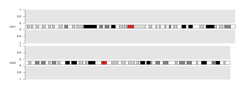
kp <- plotKaryotype(plot.type=2, chromosomes=c("chr1", "chr2"))
kpDataBackground(kp)
kpDataBackground(kp, data.panel = 2)
kpAxis(kp, data.panel=1)
kpAxis(kp, data.panel=2)
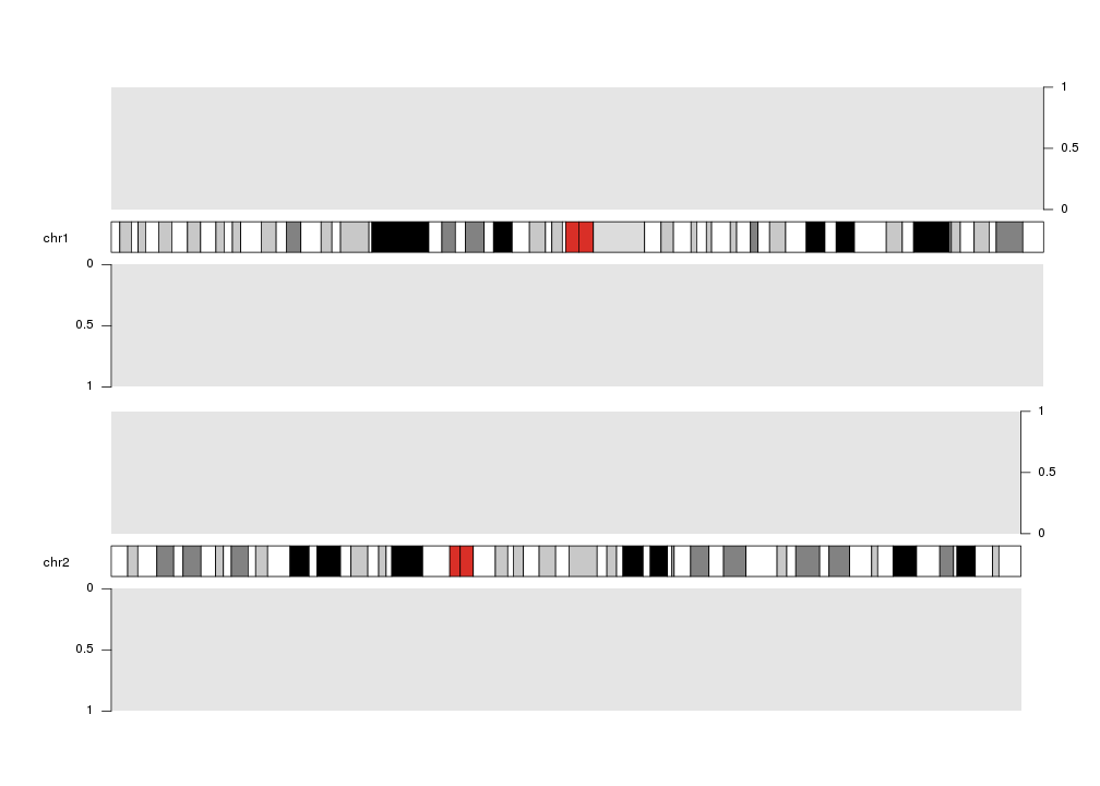
Axis can be plotted at either left or right side of any on the data plots using
the side parameter: 1 for left, 2 for right.
kp <- plotKaryotype(plot.type=2, chromosomes=c("chr1", "chr2"))
kpDataBackground(kp)
kpDataBackground(kp, data.panel = 2)
kpAxis(kp, data.panel=1, side = 2)
kpAxis(kp, data.panel=2)
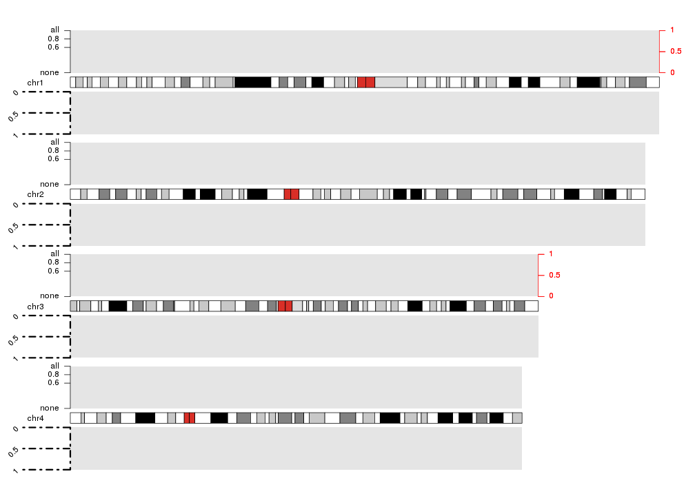
And they can be customized in many ways:
- number of ticks and their positions and labels (with
numticks,tick.posandlabels) - colors of the lines and text (with
col) - length of ticks (with
tick.lenAttention! the length is in number of bases!) - on which chromosomes the axis has to be drawn (with
chromosomes(can befirst,last,allor a vector of chromosome names)). By default in plot types 1, 2 and 6 (vertically stacked chromosomes) the axis will be plotted in all chromosomes and in plot types 3, 4, 5 and 7 (all chromosomes in a single line) only in the first (or last ifside=2) chromosome - all standard graphical parameters
kp <- plotKaryotype(plot.type=2, chromosomes=c("chr1", "chr2", "chr3", "chr4"))
kpDataBackground(kp)
kpDataBackground(kp, data.panel = 2)
kpAxis(kp, data.panel=1, side = 1, numticks = 4, tick.pos = c(0, 0.6, 0.8, 1), labels = c("none", 0.6, 0.8, "all") )
kpAxis(kp, data.panel=1, side = 2, col="red", chromosomes = c("chr1", "chr3"))
kpAxis(kp, data.panel=2, tick.len = 20e6, srt=45, lwd=3, lty=4)
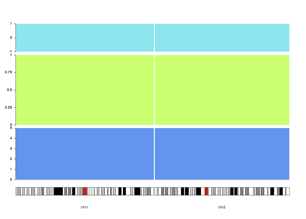
Finally, the vertical positioning of the axis can be controlled with
r0 and r1
as with most plotting functions. With this, we can use axis to mark different
track like regions in the data panels. In addition, ymin and ymax can be
used to set the extrem values for the axis.
kp <- plotKaryotype(plot.type=4, chromosomes=c("chr1", "chr2"))
kpDataBackground(kp, r0=0, r1=0.33, color = "cornflowerblue")
kpAxis(kp, numticks = 6, r0=0, r1=0.33, ymin=0, ymax=5 )
kpDataBackground(kp, r0=0.35, r1=0.8, color = "darkolivegreen1")
kpAxis(kp, numticks = 5, r0=0.35, r1=0.8, ymin=0, ymax=1 )
kpDataBackground(kp, r0=0.82, r1=1, color = "cadetblue2")
kpAxis(kp,  numticks = 3, r0=0.82, r1=1, ymin=-1, ymax=1 )