Gene Density Ideograms
Since karyoploteR 1.8 it is possible to plot on the ideogram regions using the
data.plot="ideogram". In addtion to plotting on the ideograms, there’s the
possibility of plotting something instead of the ideograms.
In this example we’ll see how to use the ideogram data panel to create a karyoplot where ideograms are replaced by the gene density levels. We’ll use the gene position information from the TxDb.Hsapiens.UCSC.hg19.knownGene Bioconductor package.
We’ll start by using the genes function to create a GRanges object
with all genes.
library(TxDb.Hsapiens.UCSC.hg19.knownGene)
txdb <- TxDb.Hsapiens.UCSC.hg19.knownGene
all.genes <- genes(txdb)
head(all.genes)
## GRanges object with 6 ranges and 1 metadata column:
##             seqnames              ranges strand |     gene_id
##                <Rle>           <IRanges>  <Rle> | <character>
##           1    chr19   58858172-58874214      - |           1
##          10     chr8   18248755-18258723      + |          10
##         100    chr20   43248163-43280376      - |         100
##        1000    chr18   25530930-25757445      - |        1000
##       10000     chr1 243651535-244006886      - |       10000
##   100008586     chrX   49217763-49233491      + |   100008586
##   -------
##   seqinfo: 93 sequences (1 circular) from hg19 genome
And then, use the kpPlotDensity function to plot the gene density over the
genome. We’ll start with 1 chromosome to get a better view and then we’ll
move to the whole genome.
library(karyoploteR)
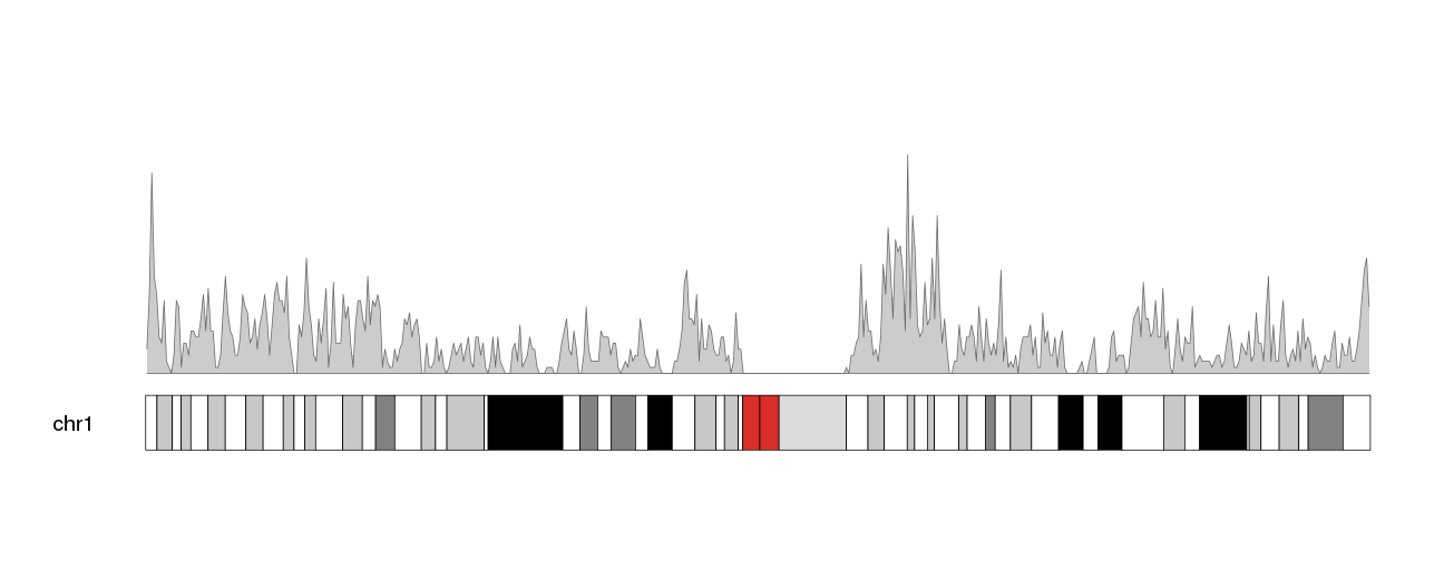
kp <- plotKaryotype(plot.type=1, chromosomes="chr1")
kp <- kpPlotDensity(kp, all.genes)
We can see the plot density computed with the default window size, 1 megabse.
Changing the window size to 500 kilobases we’ll get a less smoothed version of
the data. We can also enlarge the chromosome name changing the cex parameter
(character expansion) in plotKaryotype.
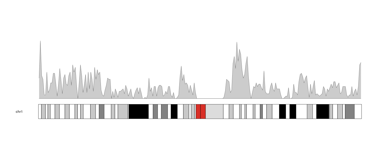
kp <- plotKaryotype(plot.type=1, chromosomes="chr1", cex=1.6)
kpPlotDensity(kp, all.genes, window.size = 0.5e6)
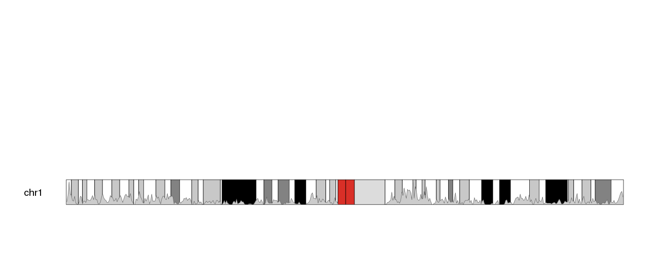
Now, to move this data into the ideogram we simply need to specify that as the
data panel with data.panel="ideogram". We’ll get the exact same representation
but on the ideogram.
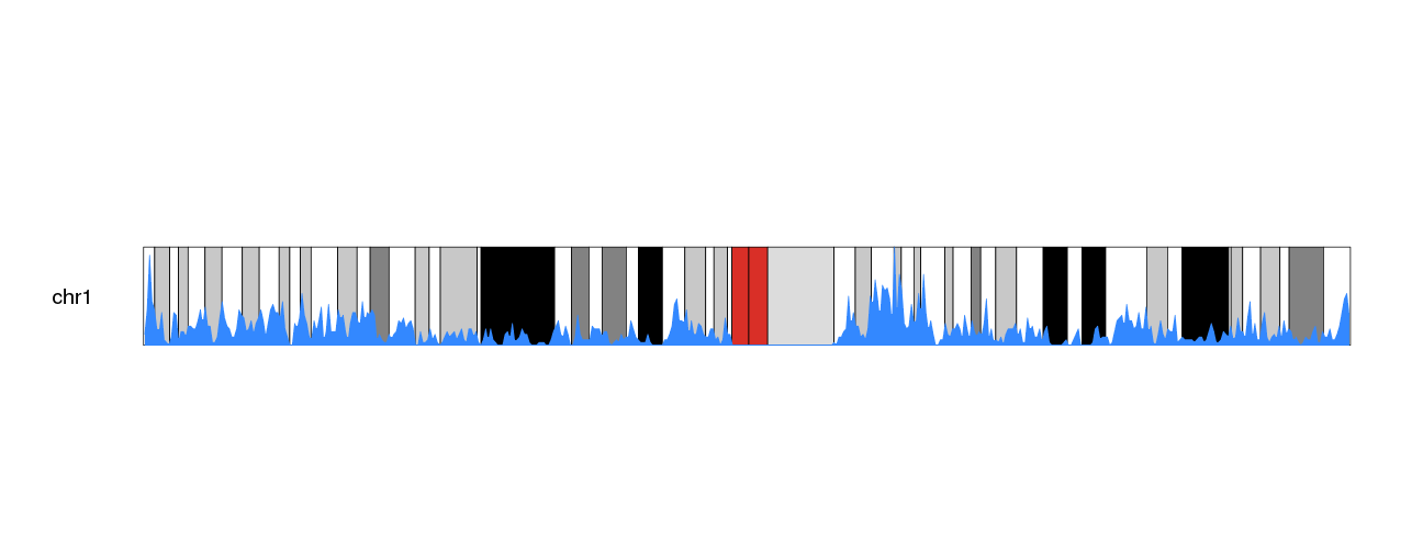
kp <- plotKaryotype(plot.type=1, chromosomes="chr1", cex=1.6)
kpPlotDensity(kp, all.genes, window.size = 0.5e6, data.panel="ideogram")
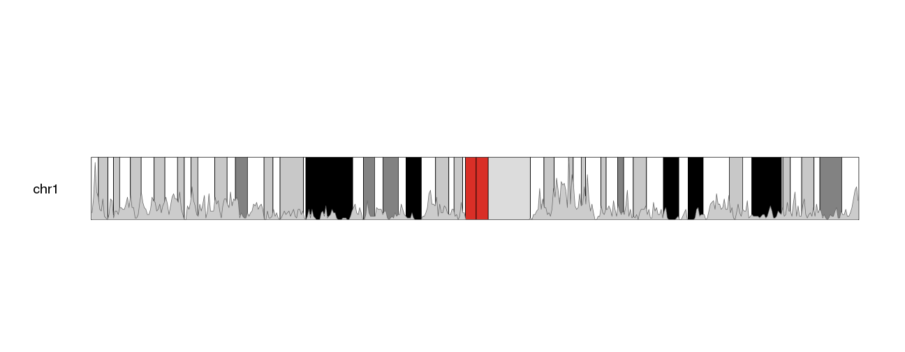
The problem now is that the whole standard data panel is empty. If we do not
want to use it to plot anything else, we can use one of the
ideogram only plot types:
plot.type=6 for chromosomes arranged in a stack or plot.type=7 for all
chomosomes in a single line. With these plot types, standard data panels are
removed and only the ideogram is available.
kp <- plotKaryotype(plot.type=6, chromosomes="chr1", cex=1.6)
kpPlotDensity(kp, all.genes, window.size = 0.5e6, data.panel="ideogram")
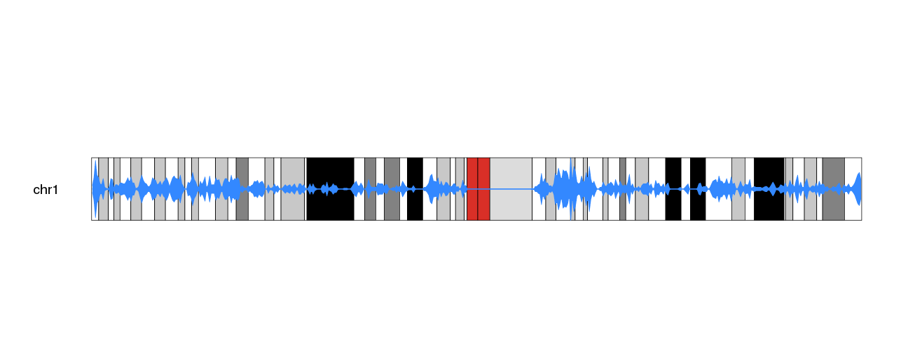
The other problem we have is that its difficult to see the density data. We’ll change the color (bot the border and the shaded area) to make it more apparent.
kp <- plotKaryotype(plot.type=6, chromosomes="chr1", cex=1.6)
kpPlotDensity(kp, all.genes, window.size = 0.5e6, data.panel="ideogram", col="#3388FF", border="#3388FF")
We can then use the trick of duplicating the plot and inverting one of them with an r0 smaller than r1 to get a more interesting.
kp <- plotKaryotype(plot.type=6, chromosomes="chr1", cex=1.6)
kpPlotDensity(kp, all.genes, window.size = 0.5e6, data.panel="ideogram", col="#3388FF", border="#3388FF", r0=0.5, r1=1)
kpPlotDensity(kp, all.genes, window.size = 0.5e6, data.panel="ideogram", col="#3388FF", border="#3388FF", r0=0.5, r1=0)
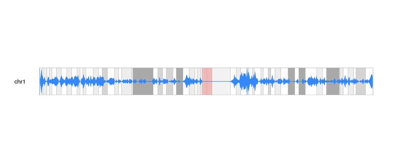
And to the the plot density popping out more from the G-banding colors, we
can dim the cytobands intensity. To do that we could get the color table
with getCytobandColors() and modify them before calling plotKaryotype()
or we could simply plot a white semi-transparent rectangle covering the
whole ideograms. We can plot those rectamgles with kpDataBackground and
specify a semitransparent color with the 2 last digits of the color definition
in hexadecimal (i.e. “#FF0000” is red and “#FF0000AA”, is a semi-transparent
red).
kp <- plotKaryotype(plot.type=6, chromosomes="chr1", cex=1.6)
kpDataBackground(kp, color = "#FFFFFFAA")
kpPlotDensity(kp, all.genes, window.size = 0.5e6, data.panel="ideogram", col="#3388FF", border="#3388FF", r0=0.5, r1=1)
kpPlotDensity(kp, all.genes, window.size = 0.5e6, data.panel="ideogram", col="#3388FF", border="#3388FF", r0=0.5, r1=0)
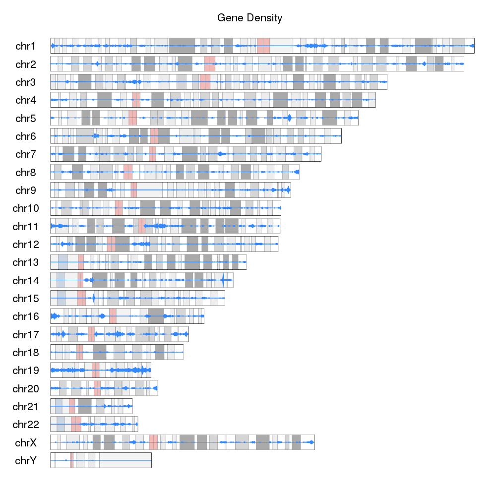
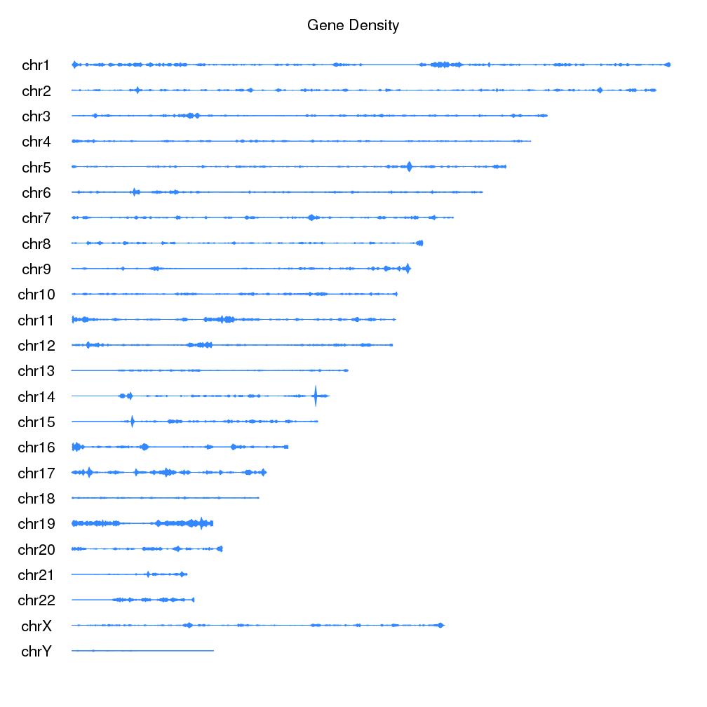
We can now add a main title, and show all chromosomes to get the final plot of gene density on the ideograms.
kp <- plotKaryotype(plot.type=6, main="Gene Density",  cex=1.8)
kpDataBackground(kp, color = "#FFFFFFAA")
kp <- kpPlotDensity(kp, all.genes, window.size = 0.5e6, data.panel="ideogram", col="#3388FF", border="#3388FF", r0=0.5, r1=1)
kp <- kpPlotDensity(kp, all.genes, window.size = 0.5e6, data.panel="ideogram", col="#3388FF", border="#3388FF", r0=0.5, r1=0)
If we want to go farther, we can actually replace the ideograms with the gene
density data. To do that we’ll set ideogram.plotter to NULL in the call
to plotKaryotype and plot the densities as we have been doing.
kp <- plotKaryotype(plot.type=6, main="Gene Density", ideogram.plotter = NULL, cex=1.8)
kp <- kpPlotDensity(kp, all.genes, window.size = 0.5e6, data.panel="ideogram", col="#3388FF", border="#3388FF", r0=0.5, r1=1)
kp <- kpPlotDensity(kp, all.genes, window.size = 0.5e6, data.panel="ideogram", col="#3388FF", border="#3388FF", r0=0.5, r1=0)
We can use data.panel="ideogram" to use the ideogram as any other data.panel
in karyoploteR and all plotting functions work on ideograms in the same way as
they do in standard data panels.
