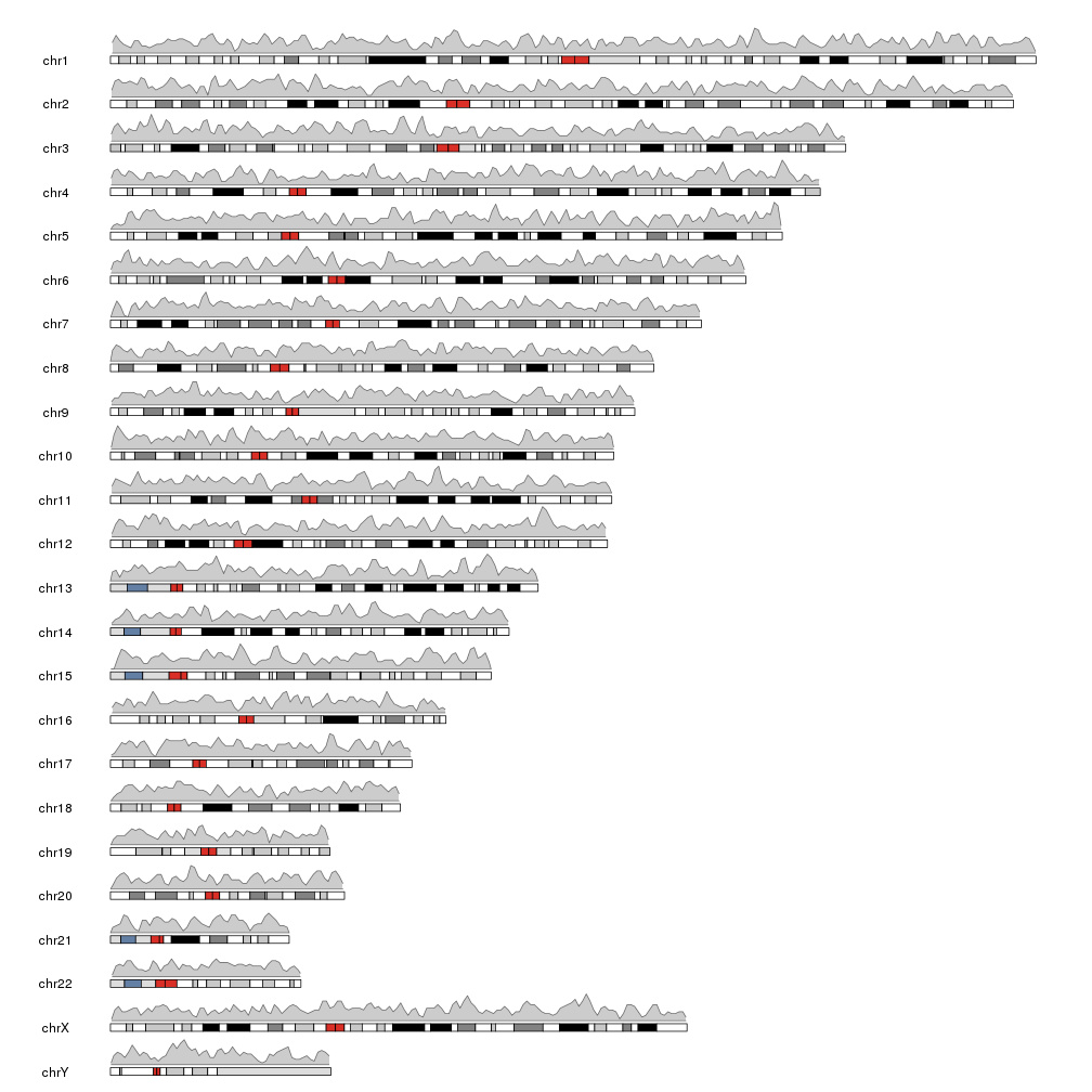
Plotting the density of genomic features
Another high level function included in karyolpoteR is kpPlotDensity. Given a set of genomic features (snps, mutation, genes or any other feature that can be positioned along the genome) it will compute and plot its density using windows. To do that it will divide the genome in a equal sized windows and will count the number of feature overlapping each of the windows.
library(karyoploteR)
regions <- createRandomRegions(nregions=10000, length.mean = 1e6, mask=NA, non.overlapping = FALSE)
kp <- plotKaryotype()
kpPlotDensity(kp, data=regions)
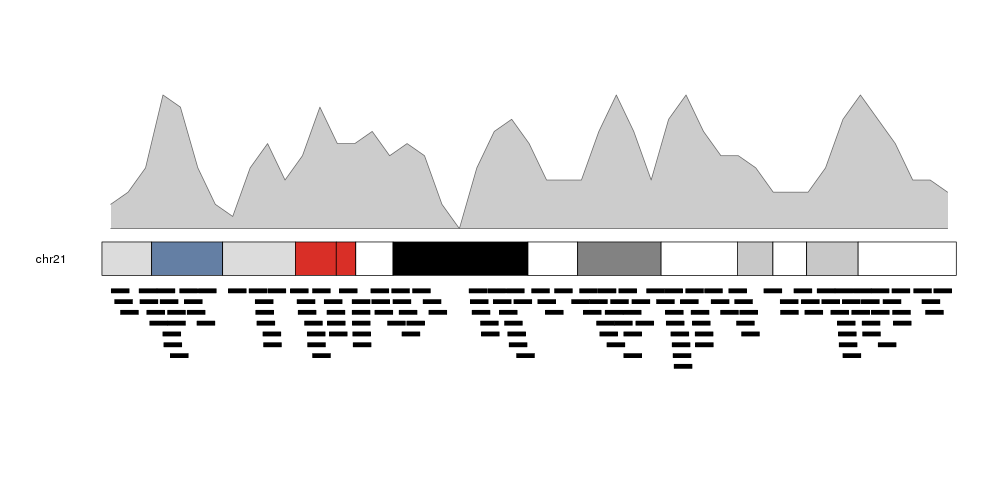
We can plot the actual regions in data panel 2 to see how they relate
kp <- plotKaryotype(plot.type=2, chromosomes = "chr21")
kpPlotDensity(kp, data=regions)
kpPlotRegions(kp, data=regions, data.panel=2)
It is possible to adjust the window size with the window.size parameter, to get different “smoothing” levels of the data. The default is partitioning the genome in 1Mb wide windows. Take into account that much smaller windows might slow down the density computation.
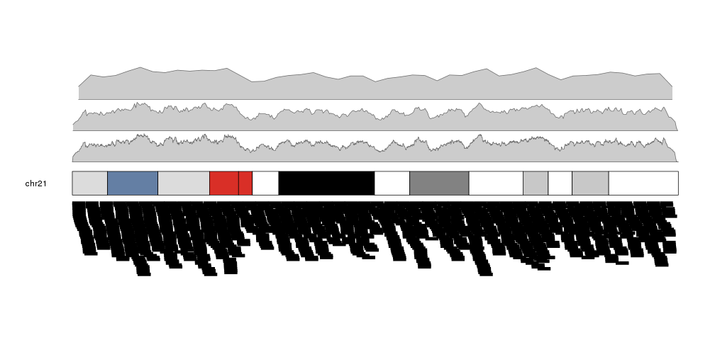
more.regions <- createRandomRegions(nregions=80000, length.mean = 1e6, mask=NA, non.overlapping = FALSE)
kp <- plotKaryotype(plot.type=2, chromosomes = "chr21")
kpPlotDensity(kp, data=more.regions, r0=0, r1=0.3, window.size = 10000)
kpPlotDensity(kp, data=more.regions, r0=0.33, r1=0.63, window.size = 100000)
kpPlotDensity(kp, data=more.regions, r0=0.66, r1=1, window.size = 1000000)
kpPlotRegions(kp, data=more.regions, data.panel=2)
It is possible to customize the appearance of the density plot using the same parameters used for kpPolygon. It is possible to specify different colors for the border (border) and the background (col). By default, if only col is given, border will be set to a darker version of col.
kp <- plotKaryotype(plot.type=2, chromosomes = "chr21")
kpPlotDensity(kp, data=more.regions, r0=0, r1=0.3, window.size = 10000, border="blue", col="orchid")
kpPlotDensity(kp, data=more.regions, r0=0.33, r1=0.63, window.size = 100000, border="blue")
kpPlotDensity(kp, data=more.regions, r0=0.66, r1=1, window.size = 1000000, col="orchid")
kpPlotRegions(kp, data=more.regions, data.panel=2)

Retrieving data computed by kpPlotDensity
As other high level functions, kpPlotDensity performs some computations
and stores their results in the KaryoPlot object it invisibly returns. In
particular it returns the windows, the density value in each window and the
maximum density. This values can be accessed via
karyoplot$latest.plot$computed.values and might be useful for things such as
setting correct axes or marking mean values.
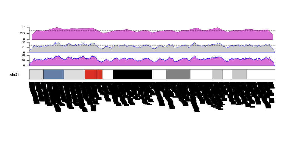
kp <- plotKaryotype(plot.type=2, chromosomes = "chr21")
kp <- kpPlotDensity(kp, data=more.regions, r0=0, r1=0.27, window.size = 10000, border="blue", col="orchid")
kpAxis(kp, ymax=kp$latest.plot$computed.values$max.density, r0=0, r1=0.27, cex=0.8)
kpAbline(kp, h=mean(kp$latest.plot$computed.values$density), lty=2, ymax=kp$latest.plot$computed.values$max.density, r0=0, r1=0.27)
kp <- kpPlotDensity(kp, data=more.regions, r0=0.34, r1=0.61, window.size = 100000, border="blue")
kpAxis(kp, ymax=kp$latest.plot$computed.values$max.density, r0=0.34, r1=0.61, cex=0.8)
kpAbline(kp, h=mean(kp$latest.plot$computed.values$density), lty=2, ymax=kp$latest.plot$computed.values$max.density, r0=0.34, r1=0.61)
kp <- kpPlotDensity(kp, data=more.regions, r0=0.68, r1=1, window.size = 1000000, col="orchid")
kpAxis(kp, ymax=kp$latest.plot$computed.values$max.density, r0=0.68, r1=1, cex=0.8)
kpAbline(kp, h=mean(kp$latest.plot$computed.values$density), lty=2, ymax=kp$latest.plot$computed.values$max.density, r0=0.68, r1=1)
kpPlotRegions(kp, data=more.regions, data.panel=2)