Plotting Areas
kpArea is similar to kpLines
but in addition to plotting the defined line, it fills the area below the line
with the specified color. It might be a useful representation for coverage,
or for continuous values such as methylation levels, etc.
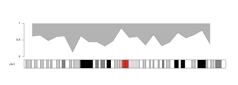
library(karyoploteR)

x <- 1:23*10e6
y <- rnorm(23, mean=0.5, sd=0.2)

kp <- plotKaryotype(chromosomes="chr1")
kpArea(kp, chr="chr1", x=x, y=y)
kpAxis(kp, ymin = 0, ymax=1)
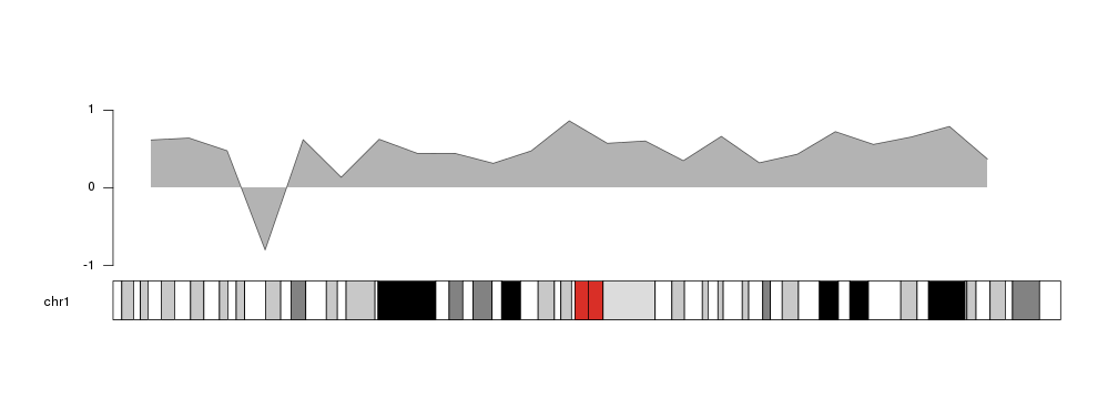
kpAreahas an additional parameter, base.y=0, that specifies the y level at
which the area ends. Its default value is 0, so the area will be shaded between
the outer line and 0. That means that if part of the line is below 0, the
shading will be above the outer line.
y[4] <- -0.8

kp <- plotKaryotype(chromosomes="chr1")
kpArea(kp, chr="chr1", x=x, y=y, ymin=-1, ymax=1)
kpAxis(kp, ymin = -1, ymax=1)
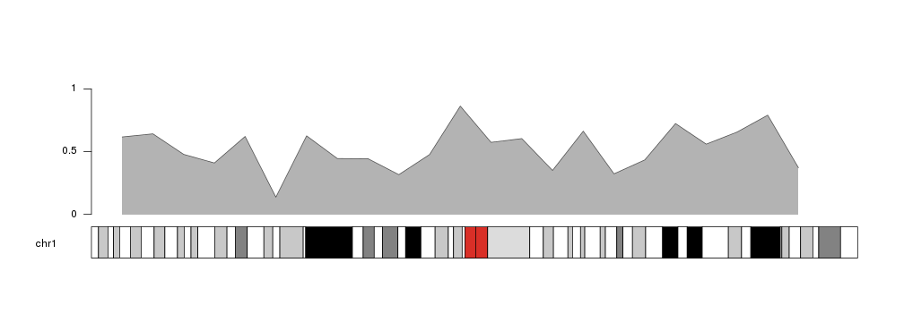
Following the same principle, we can change the value of base.y to shade the
area above the outer line.
y[4] <- 0.6

kp <- plotKaryotype(chromosomes="chr1")
kpArea(kp, chr="chr1", x=x, y=y, base.y=1)
kpAxis(kp, ymin=0, ymax=1)
It is possible to specify different colors for the outer line and the shaded
area, as well as other standard
graphical parameters
used in the R base graphics: lwd, lty… In addition, density and angle
can be used to fill the area with shading lines as in the
polygon function.
For colors, col specifies the color of the shaded area. If no color is given
(col=NULL) it will be filled with a lighter version of the line color.
Similarly, border defines the color of the outer line and it will take a
darker shade of of the area color if border=NULL. If any of these parameters
is NA the element (area or line) will not be drawn.
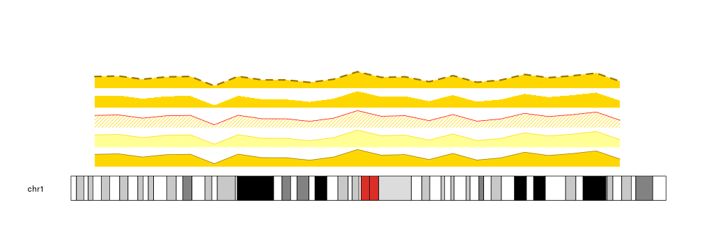
kp <- plotKaryotype(chromosomes="chr1")
kpArea(kp, chr="chr1", x=x, y=y, col="gold", r0=0, r1=0.2)
kpArea(kp, chr="chr1", x=x, y=y, border="gold", r0=0.2, r1=0.4)
kpArea(kp, chr="chr1", x=x, y=y, col="gold", border="red", density=20, r0=0.4, r1=0.6)
kpArea(kp, chr="chr1", x=x, y=y, col="gold", border=NA, r0=0.6, r1=0.8)
kpArea(kp, chr="chr1", x=x, y=y, col="gold", lty=2, lwd=3, r0=0.8, r1=1)
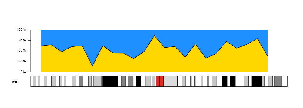
Combining this options we can create other variants of the plot, and for example use it to represent proportions over the genome.
kp <- plotKaryotype(chromosomes="chr1")
kpArea(kp, chr="chr1", x=x, y=y, border=NA, col="#FFD700")
kpArea(kp, chr="chr1", x=x, y=y, col="#1E90FF", border="black", lwd=2, base.y=1)
kpAxis(kp, ymin=0, ymax=100, numticks = 5, labels = c("0%", "25%", "50%", "75%", "100%"))