Data Panels
In karyoploteR, data is plotted in data panels, regions of the plot reserved for
that purpouse. Depending on the plot type, a karyoplot might have one or more
data panels. It is easy to visualise them using
kpDataBackground.
Standard Data Panels
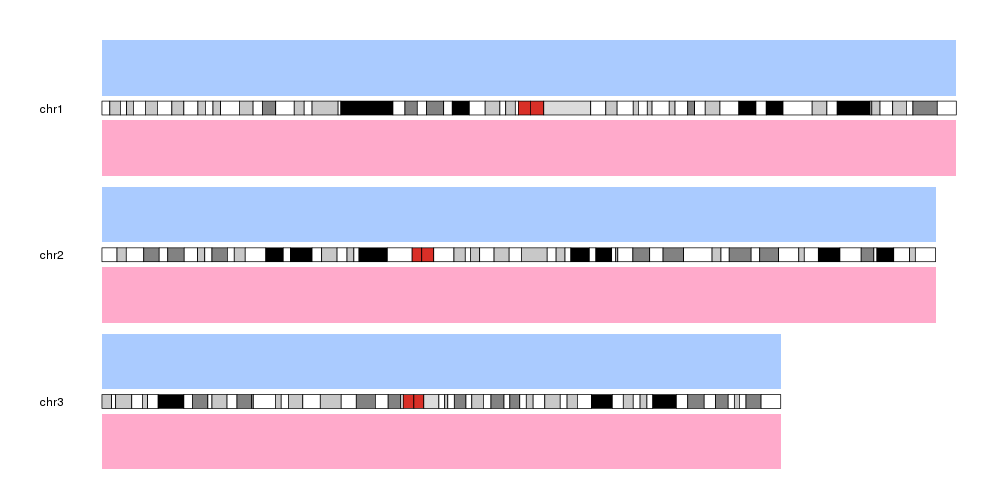
As an example, plot type 2 has two data panels, one above the ideograms and one below. We can decide on which data panel we want to plot by specifying the data.panel parameter. For example, we can create a blue(ish) background for data panel 1 (above the ideograms) and a red(ish) one for data panel 2 (below the ideograms).
library(karyoploteR)

kp <- plotKaryotype(plot.type=2, chromosomes = c("chr1", "chr2", "chr3"))
kpDataBackground(kp, data.panel = 1, col="#AACBFF")
kpDataBackground(kp, data.panel = 2, col="#FFAACB")
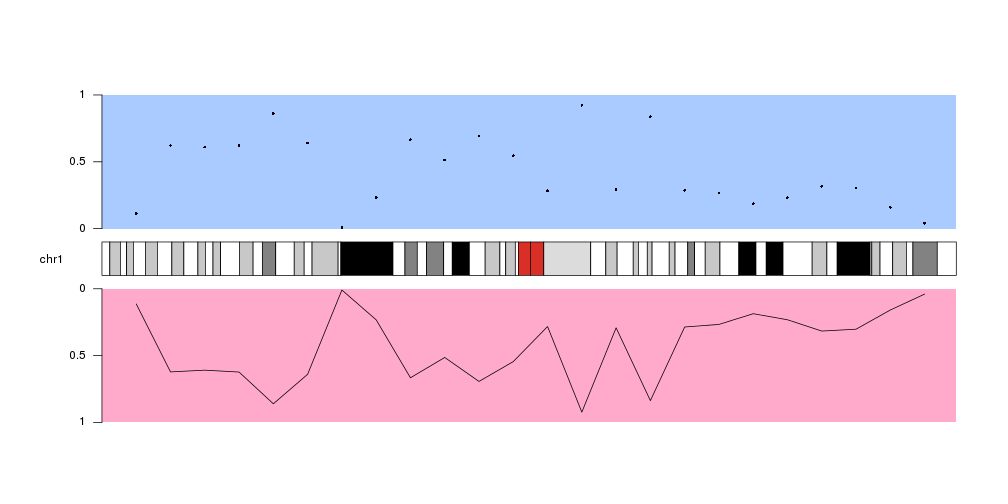
Then, to plot data on a given data panel, we use the data.panel parameter.
For example, plot the same data as points above the ideogram (data.panel=1)
and as a line below the ideogram (data.panel=2).
x <- 1:24*10e6 #one data point every 10 milion bases (10e6)
y <- runif(n = 24, min = 0, max = 1) #random y values

kp <- plotKaryotype(plot.type=2, chromosomes = "chr1")
kpDataBackground(kp, data.panel = 1, col="#AACBFF")
kpDataBackground(kp, data.panel = 2, col="#FFAACB")
kpPoints(kp, chr="chr1", x=x, y=y, data.panel = 1)
kpLines(kp, chr="chr1", x=x, y=y, data.panel = 2)
As you can see, the data in the data panel 2 is inverted with respect to data
panel 1. This is because both data panels have their base, their lowest level,
next to the ideogram and “grow” away from it. This can be changed using the
r0 and r1 parameters
to flip the plotting.
By default all data panels y axis go from 0 to 1. Plotting an axis using
kpAxis can help
visualize the data panel orientation more easily. These defaults can be changed
in every plotting function using the
data positioning parameters]
kp <- plotKaryotype(plot.type=2, chromosomes = "chr1")
kpDataBackground(kp, data.panel = 1, col="#AACBFF")
kpDataBackground(kp, data.panel = 2, col="#FFAACB")
kpPoints(kp, chr="chr1", x=x, y=y, data.panel = 1)
kpLines(kp, chr="chr1", x=x, y=y, data.panel = 2)
kpAxis(kp, data.panel=1)
kpAxis(kp, data.panel=2)
Special Data Panels
In addition to the standard data panels described above, all
plot types
have two special data panels: "ideogram" and "all".
These data panels allow plotting in non.standard places, namely, on the ideogram and over the ideogram and all standard data panels.
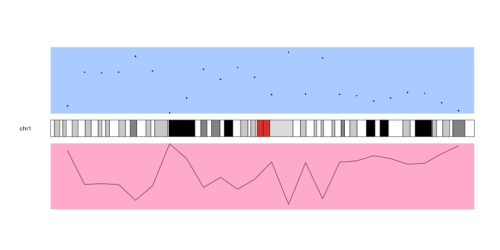
Plotting on the ideogram
To plot on the ideogram we simply need to specify data.panel="ideogram" in
the plotting function call.
For instance, to draw a semitransparent green rectangle in the ideogram we can
simply call kpRect like this
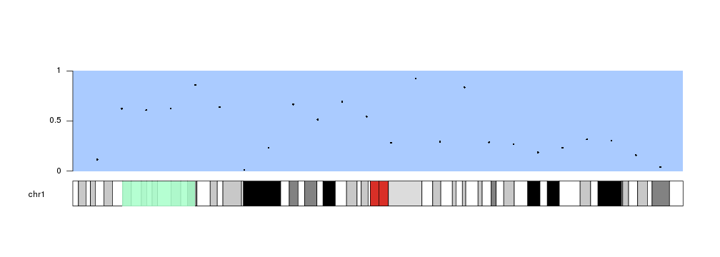
kp <- plotKaryotype(plot.type=1, chromosomes = "chr1")
kpDataBackground(kp, data.panel = 1, col="#AACBFF")
kpPoints(kp, chr="chr1", x=x, y=y, data.panel = 1)
kpAxis(kp, data.panel=1)

kpRect(kp, chr="chr1", x0=20e6, x1=50e6, y0=0, y1=1, col="#AAFFCBDD", data.panel="ideogram", border=NA)
Instead of kpRect We can use any plotting function in exactly the same way we would do in a standard data panel
kp <- plotKaryotype(plot.type=1, chromosomes = "chr1")
kpDataBackground(kp, data.panel = 1, col="#AACBFF")
kpPoints(kp, chr="chr1", x=x, y=y, data.panel = 1)
kpAxis(kp, data.panel=1)
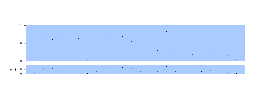
kpDataBackground(kp, data.panel = "ideogram", col="#AACBFF")
kpPoints(kp, chr="chr1", x=x, y=y, data.panel = "ideogram")
kpAxis(kp, data.panel="ideogram")
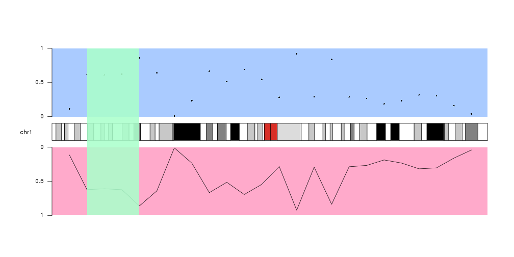
Plotting across all available space
The other special data panel available in all plot types is “all”, which includes all standard data panels and the ideogram.
A typical use case would be to highlight a region of the genome shadowing the ideogram and the data panels with a colored rectangle, but it can be used with all plotting functions.
kp <- plotKaryotype(plot.type=2, chromosomes = "chr1")
kpDataBackground(kp, data.panel = 1, col="#AACBFF")
kpDataBackground(kp, data.panel = 2, col="#FFAACB")
kpPoints(kp, chr="chr1", x=x, y=y, data.panel = 1)
kpLines(kp, chr="chr1", x=x, y=y, data.panel = 2)
kpAxis(kp, data.panel=1)
kpAxis(kp, data.panel=2)

kpRect(kp, chr="chr1", x0=20e6, x1=50e6, y0=0, y1=1, col="#AAFFCBDD", data.panel="all", border=NA)