Plotting Horizon Plots
Horizon plots (usually called horizon graphs) are a type or plots frequently used in time-series data to represent a moving value in a fraction of the vertical space required by a standard line or area plots. This is most useful when plotting and comparing different moving values. A good example and explanation can be found here at flowingdata.
In short, it cuts the data in different bands on the y axis and assigns a different color to each band, giving a more intense color to the values farther from 0. Positive and negative values are given different colors. After that, negative values are mirrored on 0 and finally all bands are plotted on top of each other, so the more intense bands representing hiher values are drawn above the lower values.
This animation shows how they are built in karyoploteR
To show how to use the function, we’ll first create a somewhat nice-looking
input data based on smoothed random data. To do that we’ll use
regioneR’s
getGenome and filterChromosomes to get the lengths of the chromosomes in the
chromosome 1 of the GRCh37/hg19 genome assembly. Then we’ll tile the chromosome
with 1 megabase regions using
GenomicRanges’ tileGenome
and create a random smoothed line with cumsum and the rollmean function
from zoo.
library(karyoploteR)
library(zoo)
set.seed(345666666)

gg <- seqlengths(filterChromosomes(getGenome("hg19"), keep.chr="chr1"))

rand.data <- tileGenome(gg, tilewidth = 1e6, cut.last.tile.in.chrom = TRUE)
rand.vals <- cumsum(runif(length(rand.data)+2, min = -1, max=1))
rand.data$y <- rollmean(rand.vals, k=3)

rand.data
## GRanges object with 250 ranges and 1 metadata column:
##         seqnames              ranges strand |                   y
##            <Rle>           <IRanges>  <Rle> |           <numeric>
##     [1]     chr1           1-1000000      * |   0.317952626540015
##     [2]     chr1     1000001-2000000      * |   0.577162382037689
##     [3]     chr1     2000001-3000000      * |   0.868442350377639
##     [4]     chr1     3000001-4000000      * |    1.30062273905302
##     [5]     chr1     4000001-5000000      * |    1.51477882809316
##     ...      ...                 ...    ... .                 ...
##   [246]     chr1 245000001-246000000      * |   0.211586338312676
##   [247]     chr1 246000001-247000000      * |   0.347693199136605
##   [248]     chr1 247000001-248000000      * |   0.371487227268517
##   [249]     chr1 248000001-249000000      * | -0.0337751372717321
##   [250]     chr1 249000001-249250621      * |  -0.210613104669998
##   -------
##   seqinfo: 1 sequence from an unspecified genome
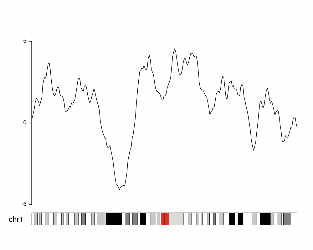
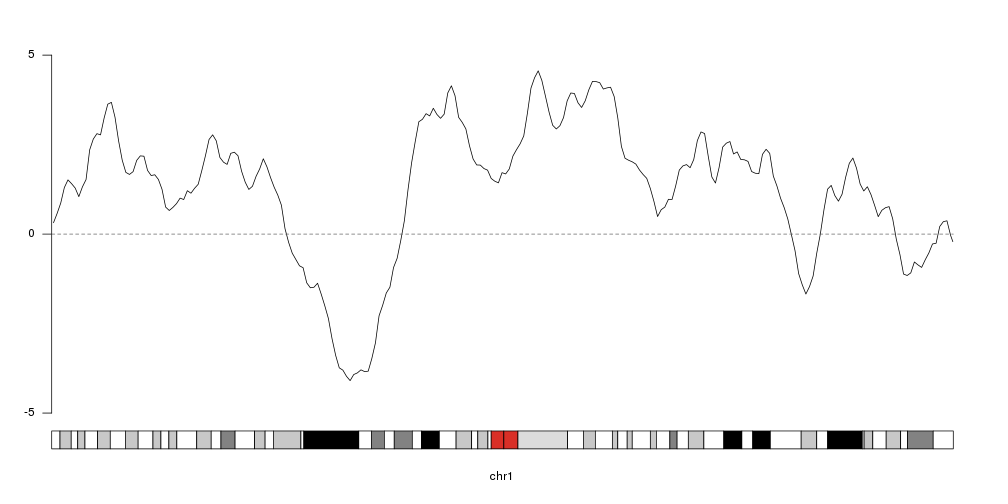
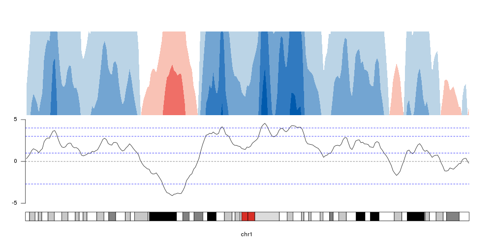
To get an idea of our random data we can plot it using
kpLines.
ymin <- floor(min(rand.data$y))
ymax <- ceiling(max(rand.data$y))
kp <- plotKaryotype(chromosomes="chr1", plot.type=4)
kpLines(kp, data=rand.data, ymin=ymin, ymax=ymax)
kpAxis(kp, ymin = ymin, ymax=ymax)
kpAbline(kp, h=0, ymin=ymin, ymax=ymax, lty=2, col="#666666")
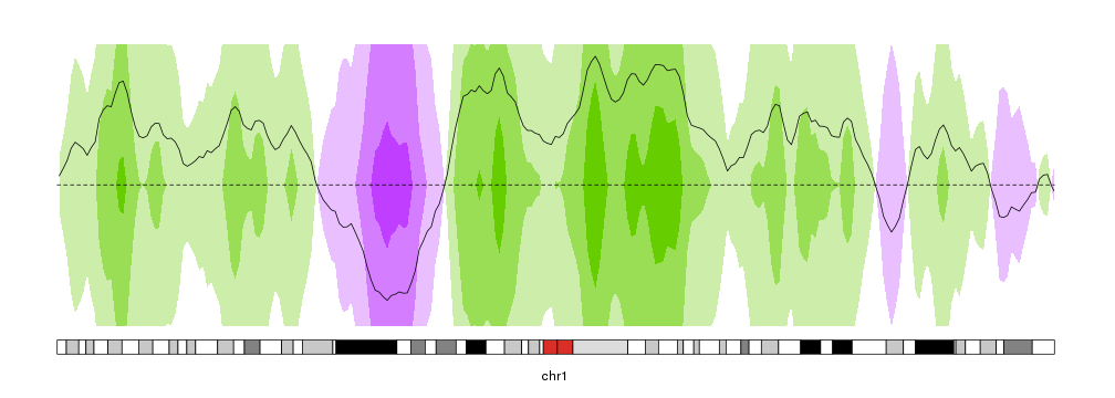
Creating the horizons
To convert that into an horizon plot, we’ll call kpPlotHorizon.
kp <- plotKaryotype(chromosomes="chr1", plot.type=4)
kpPlotHorizon(kp, data=rand.data, ymin=ymin, ymax=ymax)

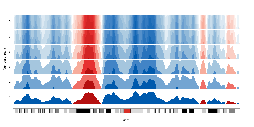
Number of parts
By default, the data is cut into 3 parts in the positive range and 3 parts in
the negative one. We can change that with the num.parts parameter. When adding
more parts, the colors will be updated accordingly.
Note: We’ll use
autotrack
to automatically position the different horizons one on top of the other.
kp <- plotKaryotype(chromosomes="chr1", plot.type=4)
kpAddLabels(kp, labels = "Number of parts", label.margin = 0.03, srt=90, pos=3)
nparts <- c(1,2,3,5,10,15)
for(i in seq_along(nparts)) {
  at <- autotrack(i, length(nparts))
  kpAddLabels(kp, labels = nparts[i], r0=at$r0, r1=at$r1)
  kpPlotHorizon(kp, data=rand.data, num.parts = nparts[i],
                ymin=ymin, ymax=ymax, r0=at$r0, r1=at$r1)
}
In addition to setting the number of parts, we can explicitely specify the
break points with the parameter breaks.
breaks <- c(-2.7, 1,3,4)

kp <- plotKaryotype(chromosomes="chr1", plot.type=4)
at <- autotrack(1,2)
kpLines(kp, data=rand.data, ymin=ymin, ymax=ymax, r0=at$r0, r1=at$r1)
kpAxis(kp, ymin = ymin, ymax=ymax, r0=at$r0, r1=at$r1)
kpAbline(kp, h=0, ymin=ymin, ymax=ymax, lty=2, col="#666666", r0=at$r0, r1=at$r1)
kpAbline(kp, h=breaks, ymin=ymin, ymax=ymax, lty=2, col="blue", r0=at$r0, r1=at$r1)

at <- autotrack(2,2)
kpPlotHorizon(kp, data=rand.data, breaks = breaks,
                ymin=ymin, ymax=ymax, r0=at$r0, r1=at$r1)
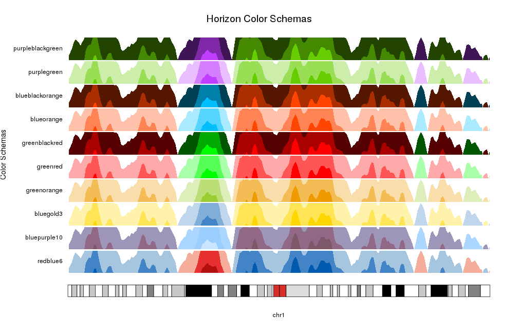
Changing colors
The simplest way to select to color scheme for an horizon plot it to use one of the predefined color schemes: redblue6, bluepurple10, bluegold3, greenorange, greenred, greenblackred, blueorange, blueblackorange, purplegreen, purpleblackgreen
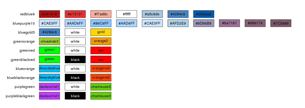
By default kpPlotHorizon will use redblue6 but it’s possible to specify any
of the available schemas.
pp <- getDefaultPlotParams(plot.type = 4)
pp$leftmargin <- 0.13
kp <- plotKaryotype(chromosomes="chr1", plot.type=4, plot.params = pp)
kpAddMainTitle(kp, "Horizon Color Schemas", cex=1.6)
kpAddLabels(kp, labels = "Color Schemas", label.margin = 0.12, srt=90, pos=3, cex=1.2)
schemas <- names(getColorSchemas()$horizon$schemas)
for(i in seq_along(schemas)) {
  at <- autotrack(i, length(schemas))
  kpAddLabels(kp, labels = schemas[i], r0=at$r0, r1=at$r1)
  kpPlotHorizon(kp, data=rand.data, col = schemas[i],
                ymin=ymin, ymax=ymax, r0=at$r0, r1=at$r1)
}
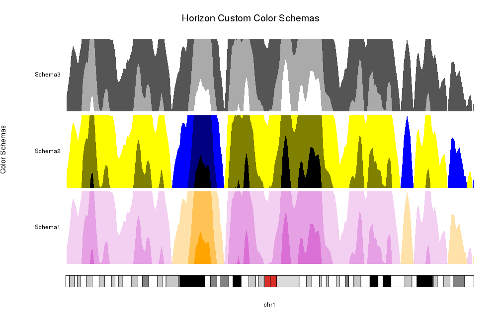
Or you can specify your own colors as a color vector. Internally it will use
horizonColors to expand (or collapse) it to the required number of colors,
one per positive part, one per negative part and a central one corresponding
to 0 and never used.
pp <- getDefaultPlotParams(plot.type = 4)
pp$leftmargin <- 0.13
kp <- plotKaryotype(chromosomes="chr1", plot.type=4, plot.params = pp)
kpAddMainTitle(kp, "Horizon Custom Color Schemas", cex=1.6)
kpAddLabels(kp, labels = "Color Schemas", label.margin = 0.12, srt=90, pos=3, cex=1.2)
schemas <- list("Schema1"=c("orange", "white", "orchid"),
                "Schema2"=c("black", "blue", "yellow", "black"),
                "Schema3"=c("white", "black", "white"))
for(i in seq_along(schemas)) {
  at <- autotrack(i, length(schemas))
  kpAddLabels(kp, labels = names(schemas)[i], r0=at$r0, r1=at$r1)
  kpPlotHorizon(kp, data=rand.data, col = schemas[[i]],
                ymin=ymin, ymax=ymax, r0=at$r0, r1=at$r1)
}
Extending horizon plots
As with all other karyoploteR plot types, it’s possible to manipulate them with the standard parameters (i.e. flipping r0 and r1 to invert them) and we can combine them with other plot types
kp <- plotKaryotype(chromosomes="chr1", plot.type=4)

kpPlotHorizon(kp, data=rand.data, col="purplegreen",
              ymin=ymin, ymax=ymax, r0=0.5, r1=1)
kpPlotHorizon(kp, data=rand.data, col="purplegreen",
              ymin=ymin, ymax=ymax, r0=0.5, r1=0)
kpLines(kp, data=rand.data, ymin=ymin, ymax=ymax)
kpAbline(kp, h=0, ymin=ymin, ymax=ymax, lty=2)