Plotting the per base coverage of genomic features
The kpPlotCoverage function is similar to
kpPlotDensity
but instead of plotting the number of features overalpping a certain genomic window,
it plots the actual number of features overlapping every single base of the genome.
Conceptually, it is equivalent to kpPlotDensity with window.size set to 1 but
much faster, since internally it uses the coverage method from
GenomicRanges.
As an example, we’ll create ten thousand random regions of one megabase of mean
length using createRandomRegions from package
regioneR. We set
non.overlapping to FALSE to allow for overlapping between random regions.
library(karyoploteR)
regions <- createRandomRegions(nregions=10000, length.mean = 1e6, mask=NA, non.overlapping=FALSE)
kp <- plotKaryotype()
kpPlotCoverage(kp, data=regions)
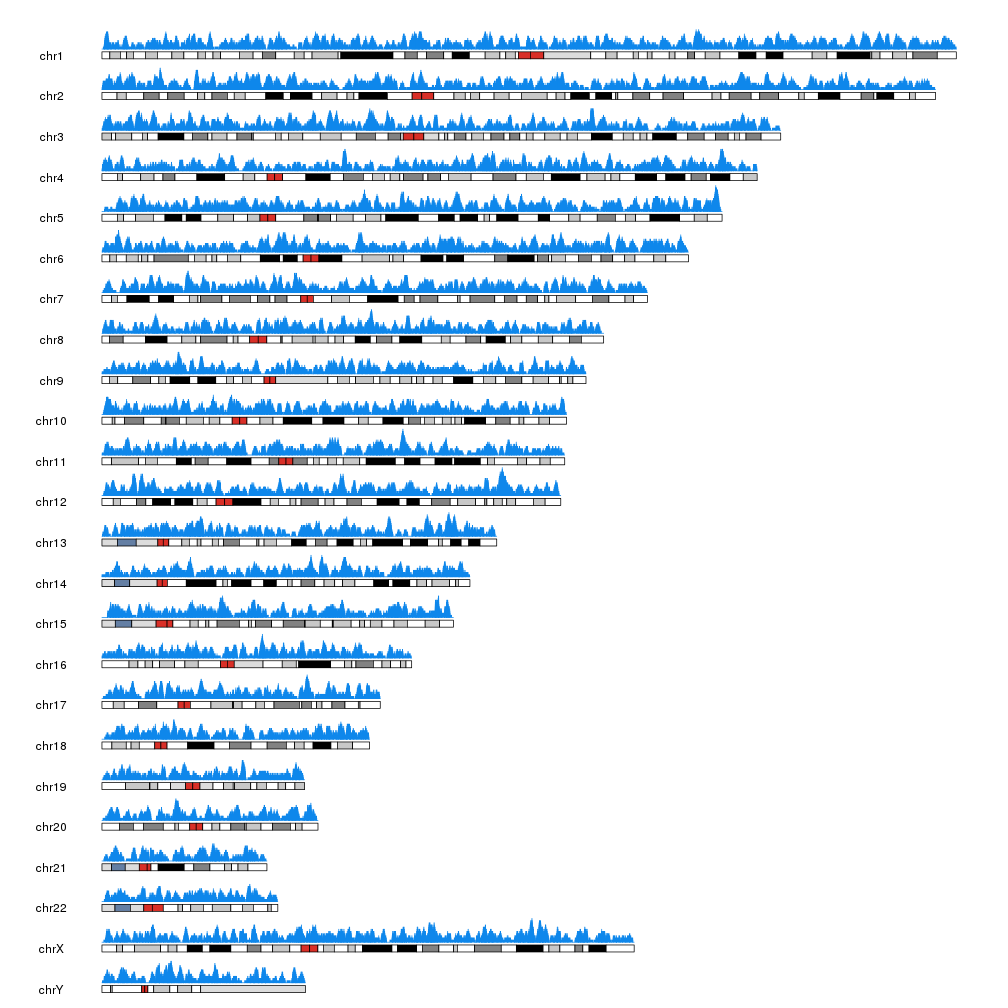
The actual representation of the data is also different than that of
kpPlotDensity: kpPlotCoverage uses kpBars to create the plot, giving
it a histogram-like appearance.
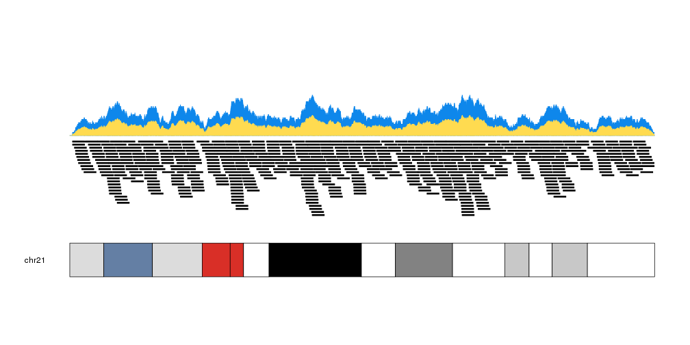
We can plot the actual regions in data panel 2 to see how they relate
kp <- plotKaryotype(plot.type=2, chromosomes = "chr21")
kpPlotCoverage(kp, data=regions)
kpPlotRegions(kp, data=regions, data.panel=2)
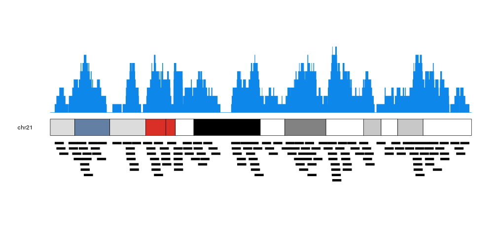
It is possible to customize the appearance of the coverage plot using the same parameters used for kpRect.
more.regions <- createRandomRegions(nregions=40000, length.mean = 1e6, mask=NA, non.overlapping = FALSE)
kp <- plotKaryotype(plot.type=1, chromosomes = "chr21")
kpPlotCoverage(kp, data=more.regions, r0=0.7, r1=1, col="#0e87eb")
kpPlotCoverage(kp, data=more.regions, r0=0.7, r1=0.85, col="#ffdb50")
kpPlotRegions(kp, data=more.regions, r0=0.65, r1=0)